Proposing a Semi-Generous Interface (CURA) for the Recreational Digital Browsing of Museums
Christie Yu, advised by Prof. Holly Rushmeier
I. ABSTRACT
In 2015, digital designer and professor Mitchell Whitelaw coined the phrase “generous interface” to describe a new kind of digital interface: one that offers information at large and up front, rather than in reaction to a specific query from the user. Unlike the searchbox (which, according to Whitelaw, is like going to a museum’s front desk, handing the attendant a note with a prompt, and getting back a selection of ten paintings), the generous interface overwhelms the user with more data than they could even imagine, from which the user can then take the time to make their own connections, and maybe even end up somewhere they never thought they would, unearthing new discoveries and fascinations along the way. While the generous interface is indeed magnanimous as portrayed like this, my project investigates the suitability of its application on recreational museum-browsing — whether such “generosity” really replicates the feeling of stepping into a museum, or whether there are other factors one must consider in digitizing (and recreationalizing) the museum experience holistically. After looking into the different factors of the recreational museum-goer’s ideal experience, especially in consideration of the changes brought about by pandemic digitization, I propose what I call the “semi-generous interface” as a more suitable touchpoint for exploring museum content, and present the prototypes (Figma) and web app demo (node.js, Express, sqlite3) of my concept. Through this project, I attempt to strip down the museum-browsing experience to its recreational roots, while simultaneously considering the consequences and artifacts that come with digitization in deep detail.
II. BACKGROUND
It is of course true that handing an attendant a note and receiving a stack of paintings is a ridiculous way to experience a museum. There are serious problems with transferring the principles of information retrieval (that have made search engines like Google so powerful) to the recreational, artistic enjoyment of visiting a museum, and yet this is mostly how museums offer their collections online.
Figures 1 & 2: Sample museum search interfaces
Figures 1 and 2 show a simple search of “winter” from both the Yale Center for British Art as well as the Metropolitan Museum of Art in New York City. It seems that, for museums of all scales, the current digital convention is to start users with searchbar. Even if results are mostly visually expressed (that is, expressed in images rather than words), this sort of search interface is not much different than information retrieval engines like Google.
On the other hand, should digitization always mimic reality, or are there important considerations to make in regards to the intermediary nature of that process — turning what we are used to in three-dimensional, sensational space into a two-dimensional resolution-limited and confined space? In this section of my paper, I discuss this conflict of physical versus digital experience drawing from museum experts and reports from the past few years about what makes the browsing experience what it really is.
A. More clicking, less watching?
In 2001, John Vergo and his collaborators wrote a seminal user experience paper titled “‘Less Clicking, More Watching’: Results from the User-Centered Design of a Multi-Institutional Web Site for Art and Culture.” In it, they show that viewers much prefer a guided tour-like digital experience to being left to browse digital collections on their own: “When users go to a web site of arts and culture looking for entertaining and educational content, they seem to be less interested in clicking to find information than in watching people, especially experts and celebrities, present and discuss artistic works from their perspective,” they say. After over twenty years, is this principle of providing users with “watching” content rather than “clicking” content still true, especially in the context of media? With the rise of non-stop clicking in social media as well as the new cultures of micro-blogging and micro-attention spans, has our familiarity with technology brought a change in our cultural attitude toward interacting with media sites? Not to mention the arrival of the pandemic, which brought digitizations never before seen: of classes, of meetings, of commencements… I turn to an article titled “Heritage in lockdown: digital provision of memory institutions in the UK and US of America during the COVID-19 pandemic (2020),” by Samaroudi et al., for answers to these questions.
It turns out that, after interviewing 83 “memory institutions” in the UK and the USA ranging from smaller collections to large institutions, Samaroudi et al. found that most museums do not offer so much of what Vergo et al. suggested; while most technological efforts were concentrated on communicating with museum patrons via newsletters or emails, virtual visits and events only make up around 11 percent of virtual offerings from these museums, with virtual visits coming last on this list (Figure 3).
It turns out that, after interviewing 83 “memory institutions” in the UK and the USA ranging from smaller collections to large institutions, Samaroudi et al. found that most museums do not offer so much of what Vergo et al. suggested; while most technological efforts were concentrated on communicating with museum patrons via newsletters or emails, virtual visits and events only make up around 11 percent of virtual offerings from these museums, with virtual visits coming last on this list (Figure 3).
Figure 3: Proportion of Virtual Offerings from Museums
Figure 3 is a data visualization showing the spread of virtual offerings provided by “memory institutions” surveyed by Samaroudi et al. across the U.S. and U.K.
That is, museums are not, as Vergo et al. suggested, offering as many guest speakers and virtual tours as they are spending time on curating digital collections (25 percent in the U.S.). Whether due to unpopularity or inaccessibility, the reduction of spectator events seems to suggest that “Less clicking, more watching” may be a principle lost in this digital age — an age where, in a paper by Art Fund UK cited by Samaroudi et al., a survey of 427 museum professionals showed that 86 percent of organizations boosted their presence online during the pandemic.
On another note, Samaroudi et al. break down the museum-going demographic into three parts:
On another note, Samaroudi et al. break down the museum-going demographic into three parts:
I. Audiences seeking learning support
II. Audiences seeking emotional support and entertainment
III. Stakeholders who wish to keep involved
II. Audiences seeking emotional support and entertainment
III. Stakeholders who wish to keep involved
But their categories for those who belong to group (II) — audiences seeking emotional support and entertainment — are alarming: “bored people,” “stressed out/scared people,” “lonely people,” “people who can’t stop working,” “working from home or newly unemployed people,” “grieving people,” and “people wanting to help others.” While these categories certainly match the label of “seeking emotional support,” museum audiences looking for simple entertainment are still neglected in research on digital recreation. While recreational browsing manifests easily in other fields, such as social media, online shopping, or Wikipedia browsing, when it comes to higher-brow art and artifacts, such as those which belong to “memory institutions” like museums, recreation is much less highlighted and properly identified as a visiting purpose.
B. The topography of browsing
What makes digital browsing such a large leap from physical browsing? To answer this question, we may turn toward e-reading, which is a field with greater grounding in recreation than digital museum browsing. In an article in Scientific American titled “The Reading Brain in the Digital Age: The Science of Paper versus Screens,” Ferris Jabr investigates “haptic dissonance”: features of reading lost in the transition between reading on paper versus reading on the screen that can make the transition unfavorable to some. One such feature is the loss of our “mental map” — that is:
In most cases, paper books have more obvious topography than onscreen text. An open paperback presents a reader with two clearly defined domains—the left and right pages—and a total of eight corners with which to orient oneself. A reader can focus on a single page of a paper book without losing sight of the whole text: one can see where the book begins and ends and where one page is in relation to those borders. One can even feel the thickness of the pages read in one hand and pages to be read in the other. Turning the pages of a paper book is like leaving one footprint after another on the trail—there's a rhythm to it and a visible record of how far one has traveled.
Jabr cites a study conducted by Anne Mangen of the University of Stavanger in Norway, in which 72 high school sophomores were asked to answer reading comprehension questions about a text; some read on paper and some read on screen. The ones reading on paper were able to use that “mental map” — the topography of what they read — in order to more quickly find relevant passages based on where they remembered reading information: on the bottom left of a page, or near the middle of the book, etc.
This topography takes shape too in the physicality of museum browsing. When Invision (the app) interviewed Beverly Serrell, a curator of 40 years at institutions such as J. Paul Getty Museum, Monterey Bay Aquarium, Exploratorium, and National Archives, Serrell revealed so many topographical features of museums that help shape how we interact with exhibit material. In the words of the article: “As soon as you step foot in a museum exhibit, you’re faced with dozens of decisions: Read the wall of text that greets you at the entrance or dive right in? Walk through the room clockwise or counter-clockwise? Examine the label on each piece or just soak in the visual elements and skip the little details?” According to Serrell, even minutiae like where and how large placards are can influence how we feel about the exhibit: descriptions should be fifty words or fewer; labels for consecutive works should be placed without sequence; some pieces should be placed in “hot spots,” or places in the floorplan conducive to many angles of sightlines.
Much of the influence of topography is on our ability to feel “in control” over the material we are supposed to enjoy. Jabr mentions that the moment of confusion before we remember how to turn the page on an e-reader — another example of “haptic dissonance” — can totally ruin our enjoyment of the “serendipity” (his word) of the text. When flipping the page of a book is so intuitive and built into how we read, any inconvenience, bug, or lag on the digital side can only be compared as a disadvantage. The same goes for museum browsing. Serrell explains that even in the physical setting, the curator must understand their audience’s intuition, or the barrier of entry to appreciating objects will be too high: “It’s amazing how people without a really deep love of their audience can be very demeaning: ‘Oh, those stupid visitors.’ But if people walk into an exhibit and immediately think, ‘This is not meant for me—they have someone in mind who’s smarter than me, or who knows something I don’t know,’ then you haven’t done your job.”
Much of the influence of topography is on our ability to feel “in control” over the material we are supposed to enjoy. Jabr mentions that the moment of confusion before we remember how to turn the page on an e-reader — another example of “haptic dissonance” — can totally ruin our enjoyment of the “serendipity” (his word) of the text. When flipping the page of a book is so intuitive and built into how we read, any inconvenience, bug, or lag on the digital side can only be compared as a disadvantage. The same goes for museum browsing. Serrell explains that even in the physical setting, the curator must understand their audience’s intuition, or the barrier of entry to appreciating objects will be too high: “It’s amazing how people without a really deep love of their audience can be very demeaning: ‘Oh, those stupid visitors.’ But if people walk into an exhibit and immediately think, ‘This is not meant for me—they have someone in mind who’s smarter than me, or who knows something I don’t know,’ then you haven’t done your job.”
A prominent demonstration of many of these challenges in digitization comes in “Snow Fall,” a 2012 award-winning New York Times article that transformed a 17,000-word story with an interactive, scrollable “curtain-effect” layout, one of the pioneering attempts at “new” digital storytelling. With slow scrolling reveals, multimedia layering, and compartmentalized pages, “Snow Fall” attempted to co-opt the suspenseful and engaging medium of graphic novels to capture audiences despite its long content. This strategy partly worked: “Snow Fall” drew in over 3.5 million readers in its first week, including new readers, for impressive clicktime. And yet that clicktime was still only around 12 minutes — not nearly enough to read 17,000 words, or even a quarter of that.
Birchall and Faherty attribute this short attention span to what they call “cognitive kickout” — what occurs when we experience too much cognitive burden due to the additional layer of interpreting digitization. Not only are screens physically tiring to the eyes, no matter how well “Snow Fall” suppressed “cognitive kick-out” with its interactivity, it is that very interactivity that strained readers’ decision-making and added to their cognitive loads. In the context of museum-browsing, one of the most important reasons why going to the museum is a relaxing rather than taxing recreational activity is because of the stillness and space it deliberately cultivates in our culture of hurry and productivity. Helen Leahy writes an entire article dedicated to how “the pace of walking should be moderated so as to accommodate both economy of motion and also aesthetic receptivity” in museum spaces. All these minutiae of physical space are necessary to create together an experience that balances information with “cognitive kickout,” whether we realize it or not.
C. Finding the Big Idea
The purpose of museum exhibits is not solely to keep the viewer comfortable, however. Back to Serrell’s interview, the entire purpose of a collection is to relay what she calls “The Big Idea” to viewers as soon as possible. “The Big Idea is the answer to the question, ‘What is this exhibit about,’” says Serrell. “Visitors generally walk through exhibits quickly and incompletely, so the Big Idea can’t appear just once in the introduction — it has to be a thread that weaves its way through the whole thing, giving people momentum, and moving them in the right direction.” That is, the space of a museum is not only something a curator needs to mediate to keep the viewer comfortable, but is also the channel through which the viewer travels to experience something the curator wants them to feel. If we analogize “the space of a museum” to digital interfaces, then interface becomes not only a hindrance to intuition, but also the very medium through which meaning must be derived for the viewer. In the words of Johanna Drucker, “Interface in a dynamic space, a zone in which reading takes place. We do not look rather through it (in spite of the overwhelming force of the ‘windows’ metaphor) or past it… Interface is what we read and how we read combined through engagement.”
In relating the spatial arrangement of museum exhibits to digital interface, perhaps the way to characterize how curators relate “The Big Idea” is through juxtaposition, done so seamlessly and intuitively that it, as Whitelaw writes and hopes for his own generous interfaces, “enable[s] audiences to lose themselves in the richness of the collections” (original emphasis). That is, juxtaposition and the transmission of “The Big Idea” is inherently interesting for viewers when done right, either with the right spatial arrangement in the physical world, or with proper interfacing in the digital world. This is what it means to succeed at curating or digitizing a curation — not to present objects arbitrarily in an unpleasant spatial arrangement or interface, but to thoughtfully juxtapose them in a spatial arrangement or interface that offers both stillness (to prevent “cognitive kickout”) and flow for the viewer to appreciate art at their own pace.
One example of arguably successful juxtaposition in the digital world might be Pinterest. As shown in Figure 4, Pinterest uses a very generous interface in its homepage to have the viewer select for themselves what interests them and what does not, backed by an obviously intelligent and well-trained algorithm. With many interests from one person juxtaposed (for instance, in Figure 4, the account-holder seems interested in art, studios, as well as some pink aesthetics), we might be able to deduce some truth about their personality — “The Big Idea” about them.
Figure 4: Pinterest
The dashboard of Pinterest algorithmically lines up images the user might enjoy in a strict grid form. The user then has the option to “pin” whatever image resonates with them into a “Pinterest board.”
And yet, from a curational perspective, this sort of online scrolling, while great at increasing user engagement, is not at all like the compact stillness of a museum exhibit. While Mitchell Whitelaw did hope his audience would “lose themselves in the richness of the collections,” here is where the museum-related danger of “cognitive kick-out” kicks in. “Losing themselves” also means losing “The Big Idea” — something that is so valuably distilled from not only the content but also the silence and intentionality of museum curations.
Yet, interestingly enough, more and more museums seem to be borrowing the Pinterest interface, though not in a generous context. That is, many museums, as shown in Figures 1, 2, 5, and 6, will lead with a search bar that returns results in a similar grid style, prioritizing the amount of visual content to the intentionality of object choices.
Figures 5 & 6: Pinterest-style museum websites
Websites of Rijksmuseum (above) and the Yale Center for British Art (below). The Rijksmuseum was recommended specifically by Whitelaw for its generous interface. Above is a screenshot of a recent collection of Rembrandt’s work publicized on the Rijksmuseum site; below is a screenshot of what returns when you search “Vanessa Bell” in the YCBA site.
While perhaps these interfaces allow for longer user engagement — an addiction scrolling cycle that Pinterest favors, it is hard to say that these interfaces accurately represent a recreational museum experience, one that does not prioritize the amount of content received, but how and why it is relayed. As such, while the search bar is, as Whitelaw points out, a ridiculous way of interfacing with museum content, the fully generous interface is not quite right either — what is necessary is a consideration of both: a semi-generous digital interface that offers viewers something they do not necessarily expect, but in a thought-provoking, “Big Idea”-relaying way.
III. PROJECT
With this background research, I completed my own project, a devising of such a “semi-generous interface” that complements the needs of recreational museum browsing.
Figure 7: A semi-generous prototype
This is the prototype of a semi-generous dashboard I made using Figma. Other files in this prototype include a “Collections” page, individual collection exhibiting pages, object detail overlays, saving options, and recently viewed pages.
In this prototype, I show a minimalistic webpage without any need for scrolling or moving the page around: an intentional attempt to keep the stillness of a museum setting and prevent the “cognitive kick-out” of recognition that scrolling does not feel the same as walking in physical space. The main component of this page is the gallery, a fixed set of boxes that will hold algorithmically generated images. For each image in this gallery, there are options to save an image, lock an image in place, algorithmically regenerate a single image, replace the whole gallery with similar images, or swap images within a gallery — all options similar to “pins” on a “Pinterest board.” The eye icon allows one to view more information about an object. The tags on the top right swiftly and concisely communicate some of the “Big Ideas” (generated through metadata) that one might want to take away from this collection, but it is unintrusive and non-elaborated to keep the viewer in control of their curation.
In practice, after experimenting with many algorithms on the 440,000 objects in the Metropolitan Museum of New York’s collection, I was able to generate curations such as those in Figure 8. Each curation has a title composed of linking tags. In Figure 8b, for instance, some items are included for being of the same tag, while others are included for being of the same time period, culture, artist, etc. In this way, all objects are linked, but in a somewhat surreptitious, thought-requiring way. By looking at one picture, the viewer may also consider what was happening during the same time period, or in the same country a few decades later, for greater historical context. No image is included for no reason at all, and the “Pinterest”-inspired features — those of swapping images, regenerating images, finding similar images, etc — were not included in this demonstration but would allow the viewer to follow their own aesthetic, historical, investigative, etc interests in a natural inquiring way.
Figure 8: Algorithmically generated curations
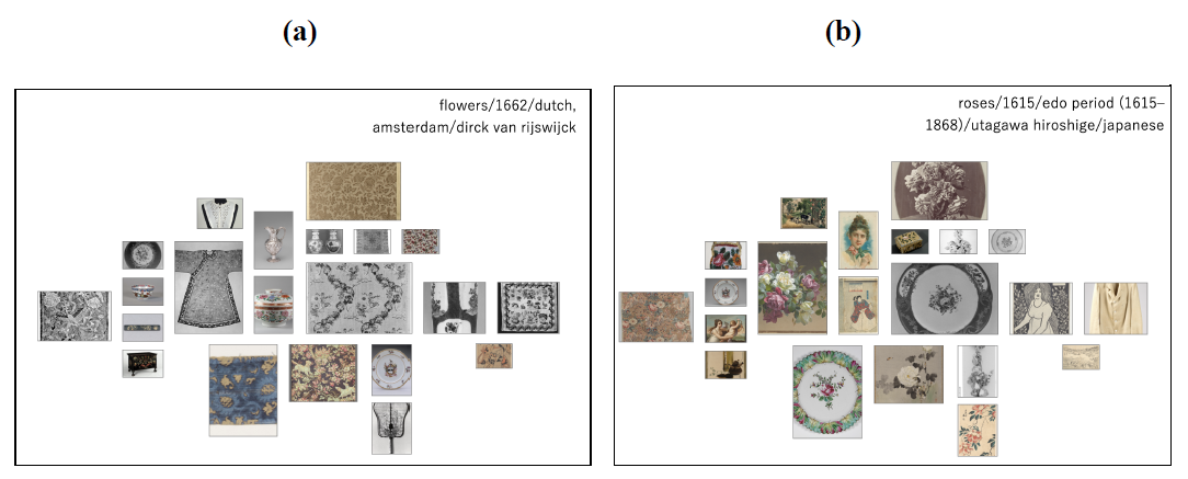
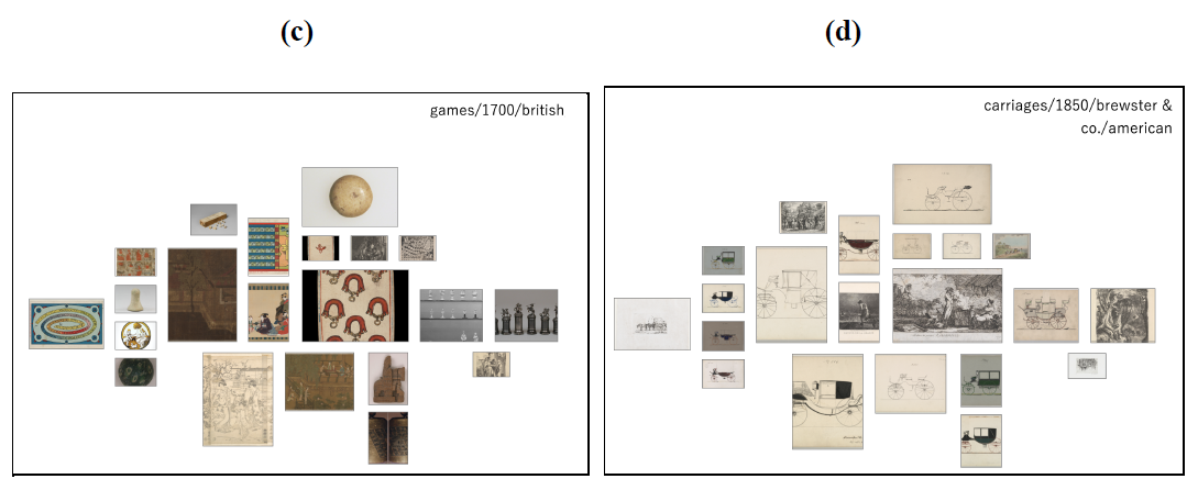
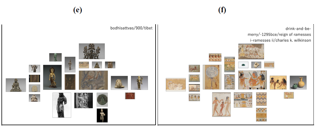
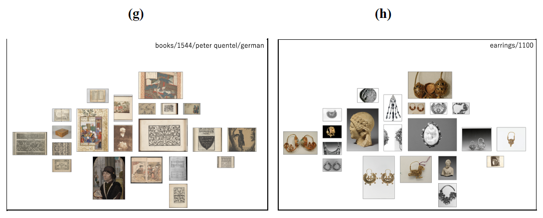
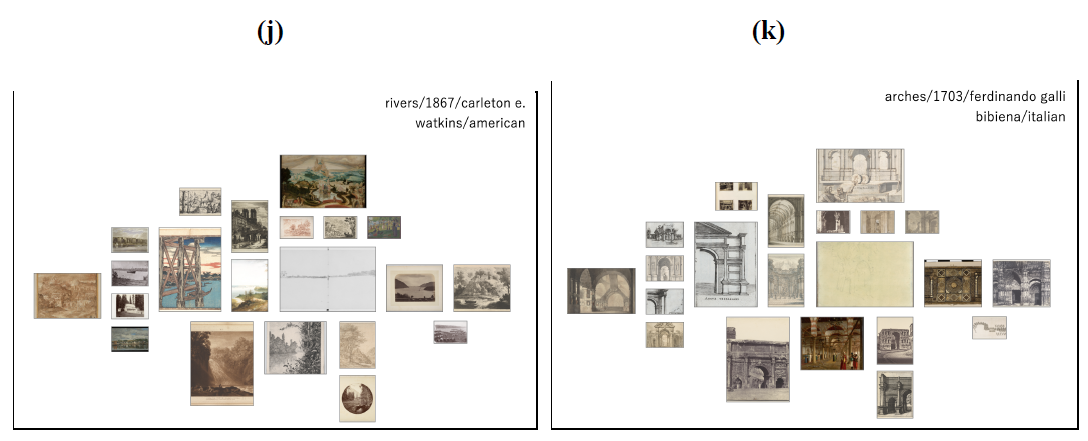
I generated curations of many kinds of interests: aesthetic for 8(a) and 8(b), object-oriented for 8(c) and 8(d), archeological for 8(e) and 8(f), media-based for 8(g) and 8(h), and place–oriented for 8(j) and 8(k). As evident, these curations differ in level of cohesion — some look very obviously like a collection, as in 8(f), while others take some time to figure out, as in 8(c). With the title tag as guidepost, it is easier to see which objects were selected on account of being from the same tag, artist, time period, movement, nationality, etc.
In addition to offering these image-based methods of generating new content, I also implemented details of each image via a modal overlay, in consideration of Schneiderman’s “overview first, zoom and filter, then details-on-demand” mantra. Figure 9b is a screenshot of what that view looks like; the information highlighted in red is clickable, and leads to a new search based on that topic, as shown in Figure 9. The tags that form the title are also clickable, as shown in Figure 10.
Figure 9: Using metadata to further search
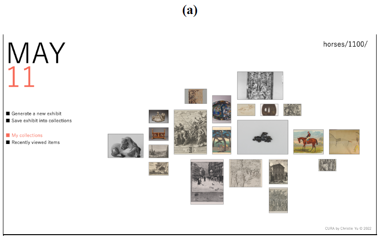
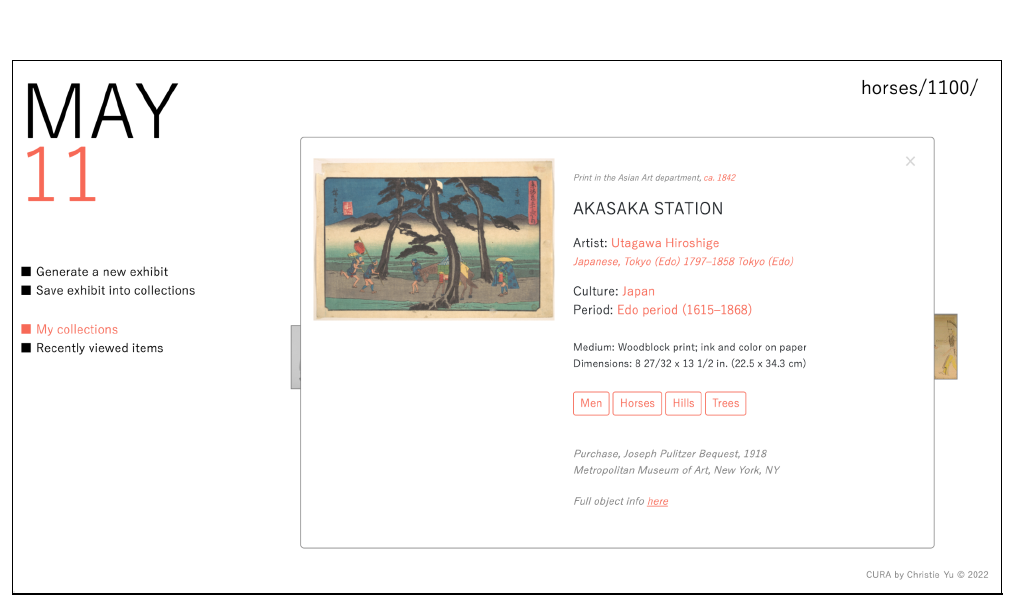

Figures 9(a), 9(b), and 9(c) show a sequence of querying. In Figure 9(a), the blue-ish painting near the center is clicked to generate Figure 9(b)’s modal. In that modal are complete details about the painting, including a link at the bottom (“Full object info here”) that leads to the Met’s original information page for the object. Clicking anything in red (e.g. date, artist, location, culture, period, tags) leads to the generation of a new curation on that topic. In this demonstration, I clicked “Edo period (1615-1868)” and was led to Figure 9(c), which is a curation of birds from that period.
Figure 10: Using the title tags to further search

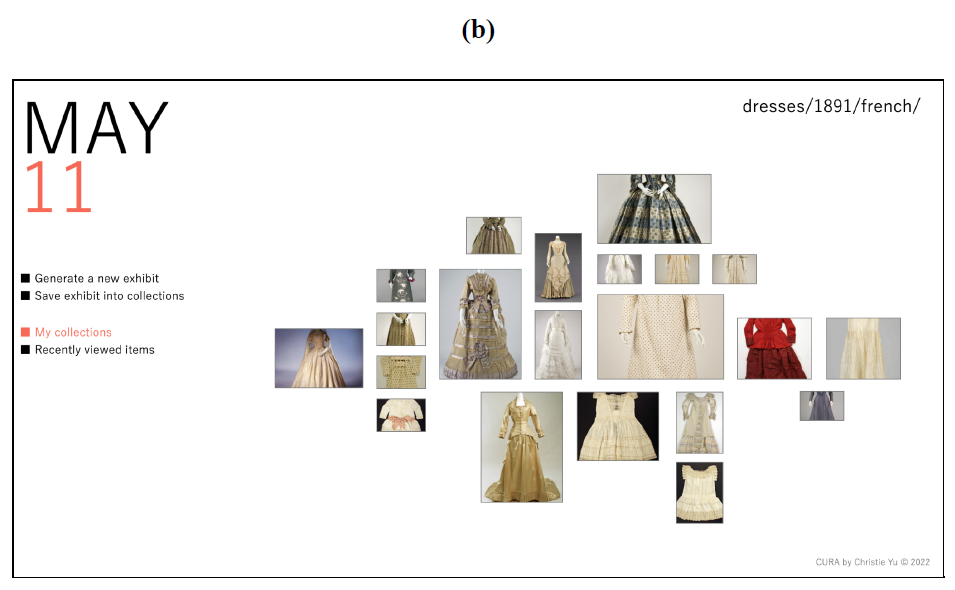
Figures 10(a) and 10(b) show a different sequence of querying from Figure 9’s. In this sequence, Figure 10(a)’s title tag “French” is clicked to generate Figure 10(b). While Figure 10(b) is still centered on France, it is now about dresses rather than butterflies.
Although I am very much biased as the creator of this interface and algorithm, my experience using this site is that it is genuinely enjoyable to continue refreshing the page and examine the different resulting collections of objects I likely would not choose to search for, were I to look through the Met’s existing digital archives or even visit in person. It is evident that, with new context via curation, all objects can be more interesting than originally presumed, especially those that have so far been hidden from the “hot spots” of the Met’s halls. In addition, not only is looking through these objects interesting, it is also ambiently educational, in that I have begun to learn and recognize names of different cultures simply by following the rabbit hole down interesting paths.
IV. FURTHER DIRECTIONS
While this project uses the Met’s database (in csv format) and its API endpoints, my original plan was to use objects from the Yale Center for British Art’s collection. I considered the YCBA (out of itself, the Yale University Art Gallery, the Peabody Museum, and other smaller local cultural collectives) because it has the most digital infrastructure: it uses a LIDO XML harvesting schema, retrievable with OAICat (Figure 11). Although such a structure makes retrieving a single object’s data very easy, it is not at all conducive to back-end processing, as there is no complete list of objects and as such there is no way to iterate through all of them, even to download to a separate database. Object metadata (in LIDO) is also separated from its image link (in IIIF), forcing another stage of data processing. As such, the YCBA (not to mention other Yale museums) should work on centralizing data as well as developing dynamic endpoint access, like the Harvard Art Museums, which have clear REST-style API service and documentation.
On that topic, even the Met’s public API is extraordinarily slow and limits queries per second. When I used their csv file to create my objects database, it took over 3 days to process 440,000 API queries. Both the YCBA (as shown in Figure 5) and the Met also have a large proportion of missing images for their digital archives, limiting what is possible for recreational online browsing. Around 200,000 out of 440,000 objects from the Met were scrapped from this project for not having image links associated. With both the YCBA and the Met facing such problems, it must be assumed that this is an issue across many museums, large or small.
Figure 11: YCBA's back-end
An example of how YCBA data is stored in LIDO and published as XML to generate their website. Under the “GetRecord” method is a request to OAICat, which handles the information retrieval.
Regarding a general problem for recreational digital browsing: there seems to be a lack of a sector-wide, integrated method to appreciate objects across many museums, thus limiting what is possible to be curated. There are obviously large copyright issues with sharing objects across institutions, but with public, systemized digitization tools like IIIF (the International Image Interoperability Framework, which standardizes how audio and visual files are transmitted through the internet), as well as the ease of sharing digital databases, our technology is able to support better centralization and access to digital archives, much like Pinterest, which amasses images from all over the internet for people to “pin” and curate.
On the topic of Pinterest, while its too-generous approach may not approximate a true museum-going experience, there are many aspects of its algorithms that digital teams at museums could certainly learn from. The Pinterest algorithm, for instance, uses how long a user stays on an image to help judge both the user’s interests and the image’s interesting features. With museum curators emphasizing the fluid nature of people’s attention spans at physical museums, collecting information about how long people spend at each “object” online can help inform the success of a digital curation, as well as shape what else might go into the digital curation. Like my own project, viewers can become micro-curators themselves this way, engaging in the process of finding what is interesting to them, so that official museum curators might better understand their demographic’s ways of thinking.
In terms of further technical inquiries, this idea of “micro-curation” involves new levels of data processing, where each curatorial link should be processed and stored to form a network which approximates something almost neural. This in itself is such an interesting machine learning question, but it is made even more complex by the fact that, for objects with no previous curatorial links (i.e. new objects), Pinterest uses computer vision instead to place that object intelligently into its curatorial network. Computer vision is especially fascinating when concentrated on art, since art, by nature of what it is, is difficult even for human vision to analyze and place in context.
Finally, a last area of exploration is using more sophisticated tag-matching, whether via natural language processing or the curatorial link network mentioned above. When I spoke with Emmanuelle Delmas-Glass, the collections data manager of the YCBA, she showed me the Getty AAT Vocabulary system, which standardizes tags across language and via definition, and then places them in a strict, art-oriented hierarchy. With this type of wiki-association starting to become attached to objects of art and history, the digitization process can begin to treat them as not only physical but semantic tokens, like words in an embedded network, to optimize our attempts to generate collections of curatorial interest.
V. BIBLIOGRAPHY & FURTHER READING
Arnold, Taylor, Nathaniel Ayers, Justin Madron, Robert Nelson, and Lauren Tilton. “Visualizing a Large Spatiotemporal Collection of Historic Photography with a Generous Interface.” ArXiv:2009.02242 [Cs], September 4, 2020. http://arxiv.org/abs/2009.02242.
Rijksmuseum. “Artists - Rijksstudio.” Accessed May 11, 2022. https://www.rijksmuseum.nl/en/rijksstudio/artists.
Birchall, Danny, and Anna Faherty. “Big and Slow: Adventures in Digital Storytelling | MW2016: Museums and the Web 2016.” Museums and the Web 2016 (blog). Accessed May 11, 2022.https://mw2016.museumsandtheweb.com/paper/big-and-slow-adventures-in-digital-storytelling/.
Yale Center for British Art. “Collections Data Sharing.” Accessed May 11, 2022. https://britishart.yale.edu/collections-data-sharing.
Drucker, Johanna. “Humanities Approaches to Interface Theory.” Culture Machine 12 (2011). http://svr91.edns1.com/~culturem/index.php/cm/article/view/434/462.
“Getty Vocabularies as LOD (Getty Research Institute).” Accessed May 11, 2022. https://www.getty.edu/research/tools/vocabularies/lod/index.html.
Harvard. “API.” Harvard Art Museums. Accessed May 11, 2022. https://harvardartmuseums.org/collections/api.
“Image API 3.0.” Accessed May 11, 2022. https://iiif.io/api/image/3.0/.
Jabr, Ferris. “The Reading Brain in the Digital Age: The Science of Paper versus Screens.” Scientific American. Accessed May 11, 2022. https://www.scientificamerican.com/article/reading-paper-screens/.
Jing, Yushi, David Liu, Dmitry Kislyuk, Andrew Zhai, Jiajing Xu, Jeff Donahue, and Sarah Tavel. “Visual Search at Pinterest.” In Proceedings of the 21th ACM SIGKDD International Conference on Knowledge Discovery and Data Mining, 1889–98. Sydney NSW Australia: ACM, 2015. https://doi.org/10.1145/2783258.2788621.
Kirkwood, Scott. “What Can Museum Exhibit Design Teach Us about UX Design?” Accessed May 11, 2022. https://www.invisionapp.com/inside-design/museum-exhibit-design/.
Leahy, Helen Rees. “‘Walking for Pleasure’? Bodies of Display at the Manchester Art-Treasures Exhibition in 1857.” Art History 0, no. 0 (November 23, 2007). https://doi.org/10.1111/j.1467-8365.2007.00562.x.
Samaroudi, Myrsini, Karina Rodriguez Echavarria, and Lara Perry. “Heritage in Lockdown: Digital Provision of Memory Institutions in the UK and US of America during the COVID-19 Pandemic.” Museum Management and Curatorship 35, no. 4 (July 3, 2020): 337–61. https://doi.org/10.1080/09647775.2020.1810483.
MW2013: Museums and the Web 2013. “Using Open Source Tools to Expose YCBA Collection Data in the LIDO Schema for OAI-PMH Harvesting.” Accessed May 11, 2022. https://mw2013.museumsandtheweb.com/paper/using-open-source-tools-to-expose-ycba- collection-data-in-the-lido-schema-for-oai-pmh-harvesting-2/.
Vergo, John, Clare-Marie Karat, John Karat, Claudio Pinhanez, Renee Arora, Thomas Cofino, Doug Riecken, and Mark Podlaseck. “Less Clicking, More Watching”: Results from the User-Centered Design of a Multi-Institutional Web Site for Art and Culture. Archives & Museum Informatics, 2008 Murray Ave, 2001. https://eric.ed.gov/?id=ED482072.
Punctuation Marks. “Very Generous of You: A Provocation for Museum’s Online Collections.” Accessed May 11, 2022. https://blogs.fasos.maastrichtuniversity.nl/digitalcultures-MA/students/jcorbelli19/2020/0 3/02/very-generous-of-you-a-provocation-for-museums-online-collections/.
ICOM CIDOC. “What Is LIDO?” Accessed May 11, 2022. https://cidoc.mini.icom.museum/working-groups/lido/lido-overview/about-lido/what-is-li do/.
White, Layna. “Digital Images in Museums: Digital Desires: What Are Museums up To?” Bulletin of the American Society for Information Science and Technology 34, no. 4 (September 17, 2008): 12–16. https://doi.org/10.1002/bult.2008.1720340404.
Whitelaw, Mitchell. “Generous Interfaces for Digital Cultural Collections.” Digital Humanities Quarterly 009, no. 1 (May 21, 2015).
“Yale DHLab - PixPlot.” Accessed May 11, 2022. https://dhlab.yale.edu/projects/pixplot/.
Zhai, Andrew, Dmitry Kislyuk, Yushi Jing, Michael Feng, Eric Tzeng, Jeff Donahue, Yue Li Du, and Trevor Darrell. “Visual Discovery at Pinterest.” In Proceedings of the 26th International Conference on World Wide Web Companion - WWW ’17 Companion, 515–24. Perth, Australia: ACM Press, 2017. https://doi.org/10.1145/3041021.3054201.

