Building Gridify: driving brand and product strategy from day one
Early last September, I got a call from my old college friend Anya. "I've got 2 coworkers who have an idea for a startup. I'm too busy right now, but could you work on some of the design?"
"Sure," I said. I had been looking for some part-time or contracting work especially in fields that were new to me. I definitely didn't know much about climate tech, but I knew it was a young and vibrant space with some of the coolest emerging technology (and lots of room for modern, trendy design to bring it to life). Plus, it sounded like there was room not only for visual design but product design as well.
I onboarded a week later as the 3rd employee of what is now Gridify.
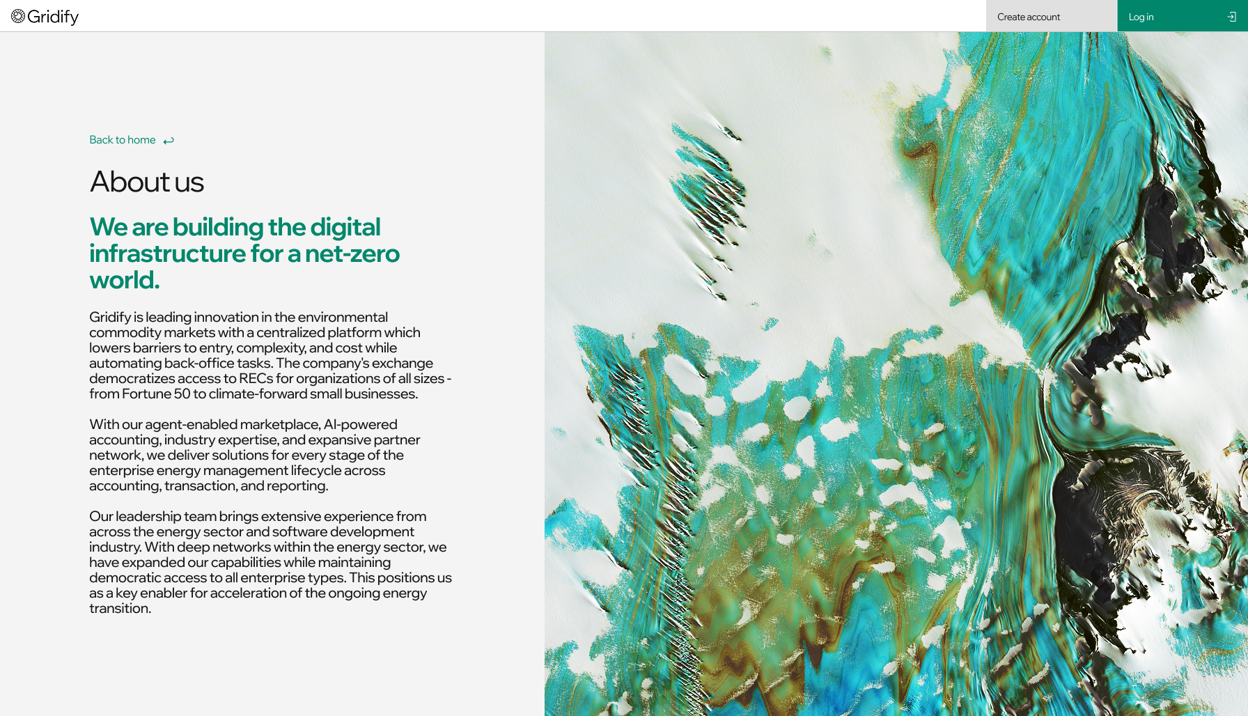
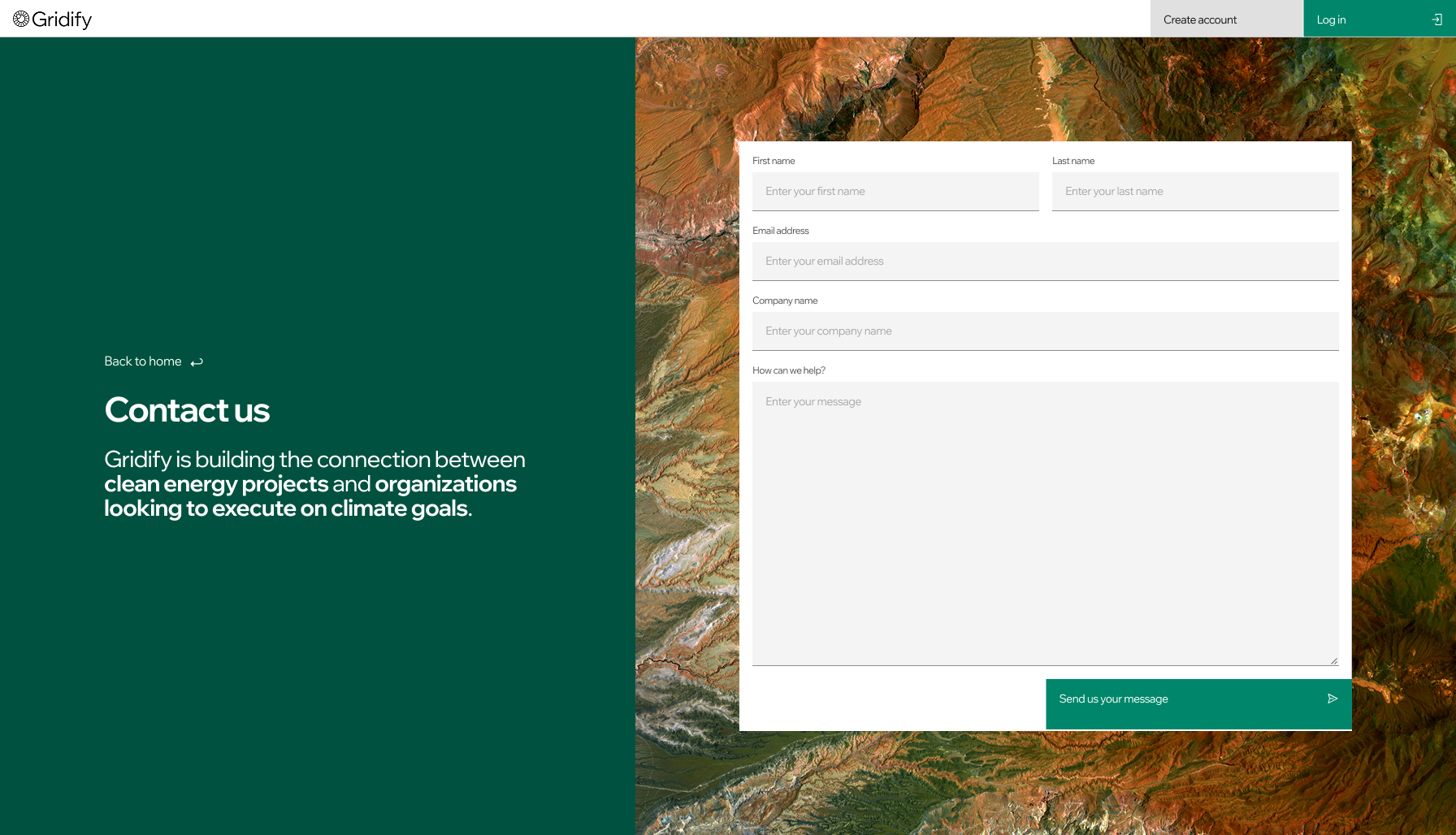
As the sole designer from day one, I defined and executed the branding strategy and led product design in Figma, driving the visual and strategic direction of both the brand and product.
The landing page (below) was a critical way to show investors who we are, the values we believe in, and our level of maturity.
Before our product had even launched, we had a few clients including LeHigh University, who wanted to learn more about our consulting process and technology we could offer. I designed the report below with Adobe InDesign and graphics from Figma.
Today, Gridify has 3 backend engineers and 2 frontend engineers, as well as a few members of the marketing and sales teams. I've remained the sole designer, driving the vision for our actual product.
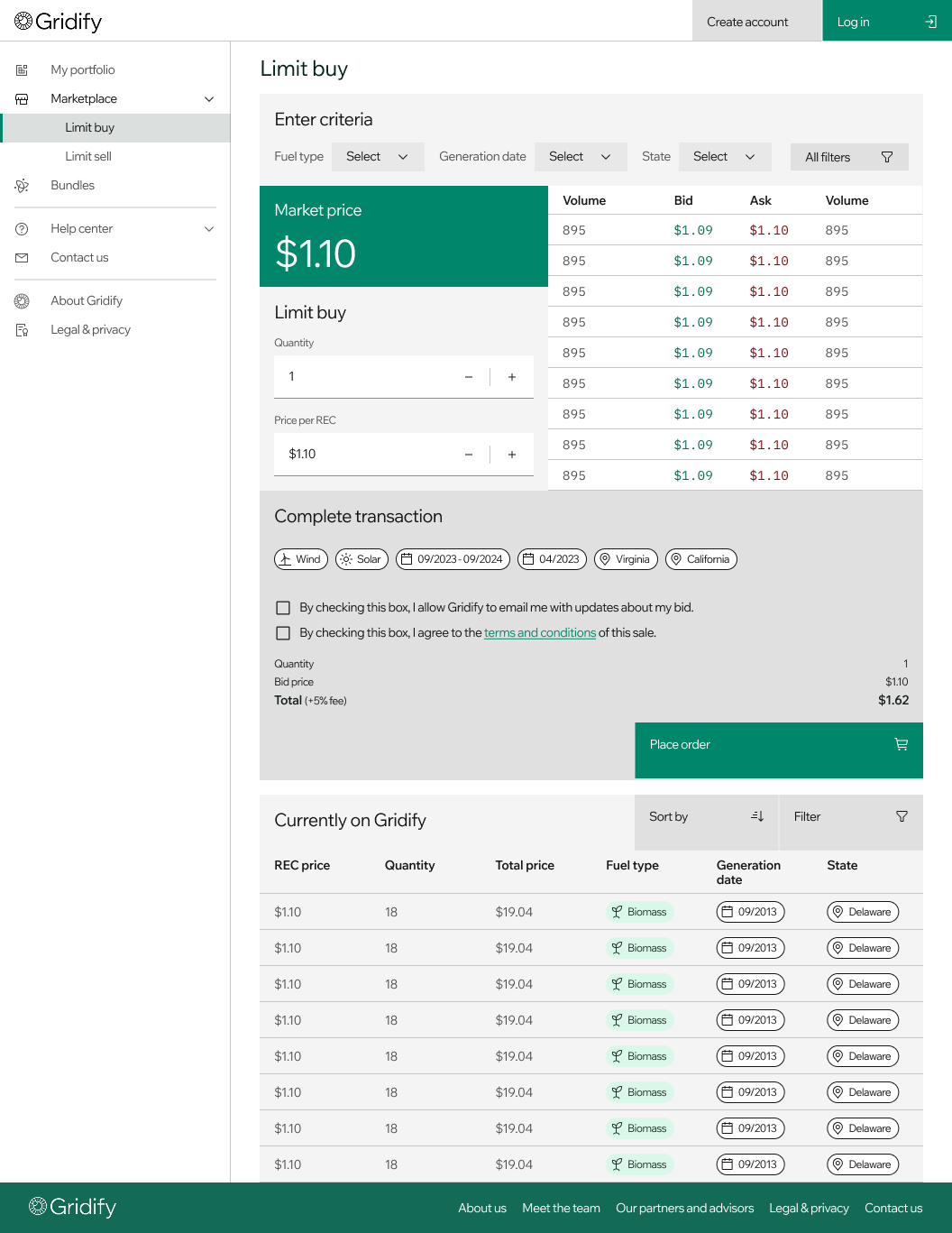
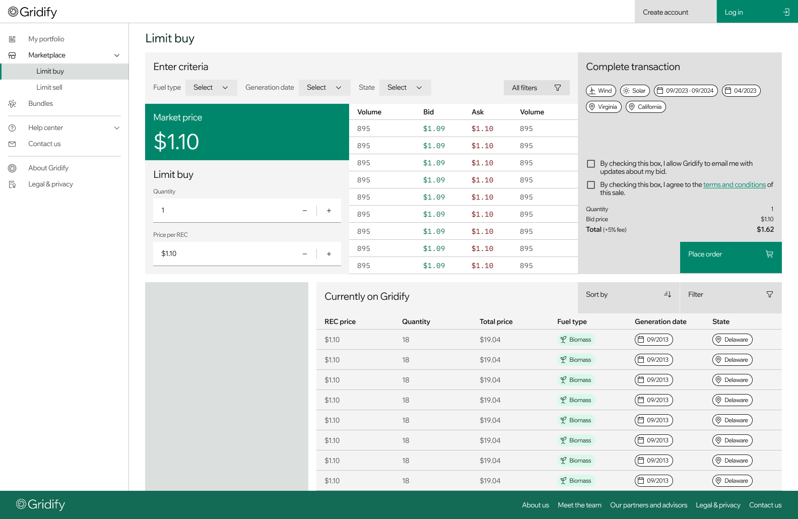
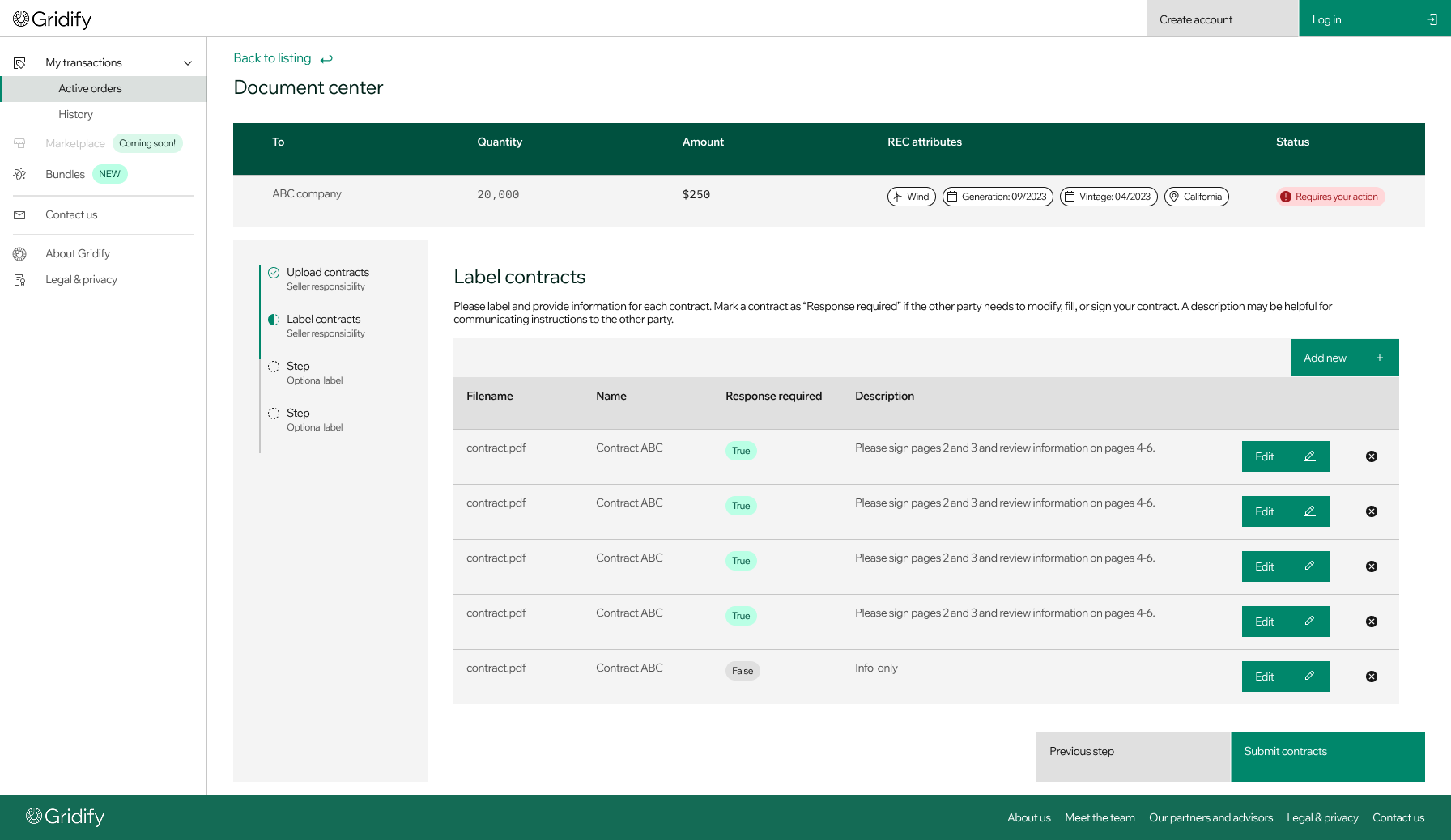
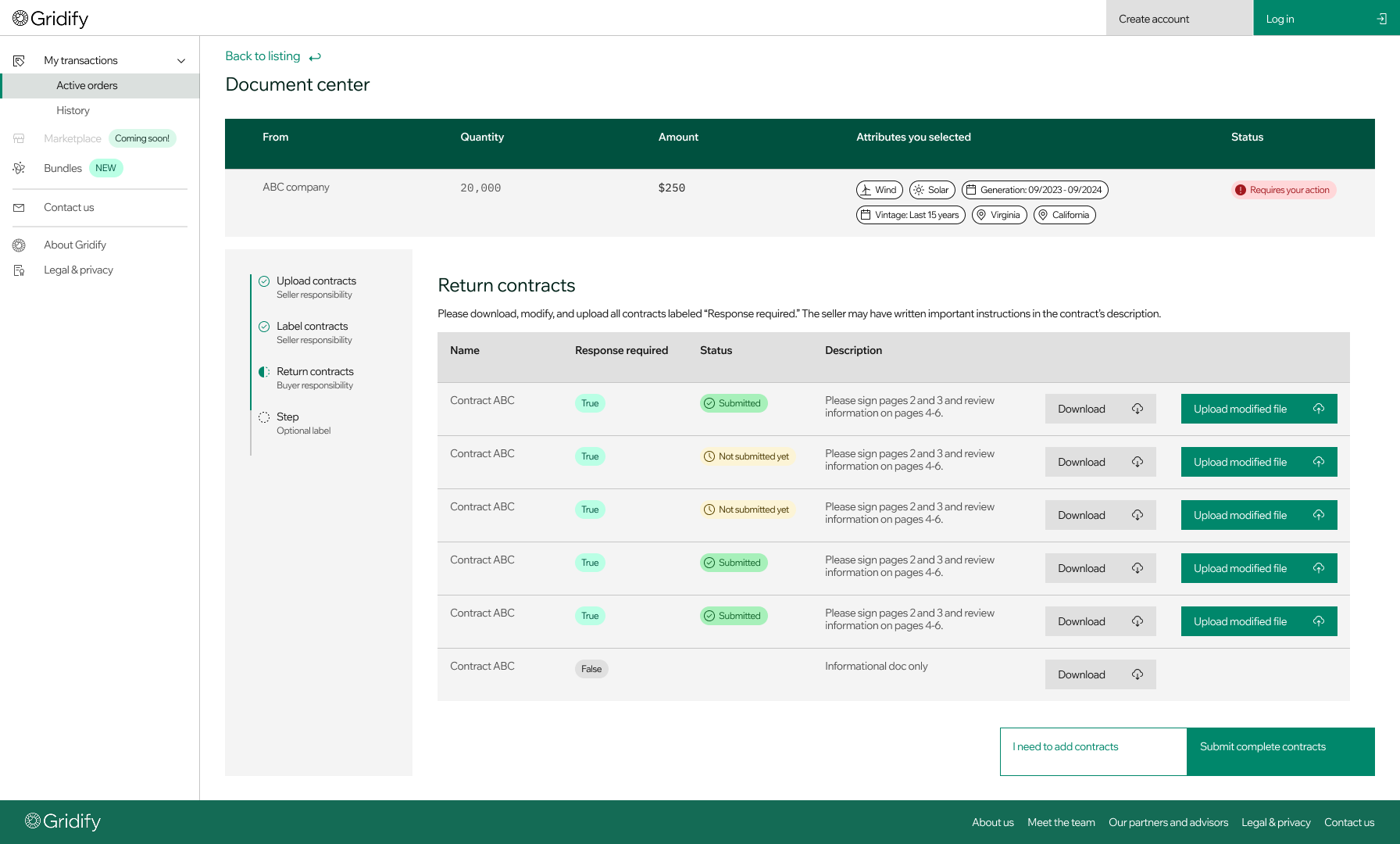
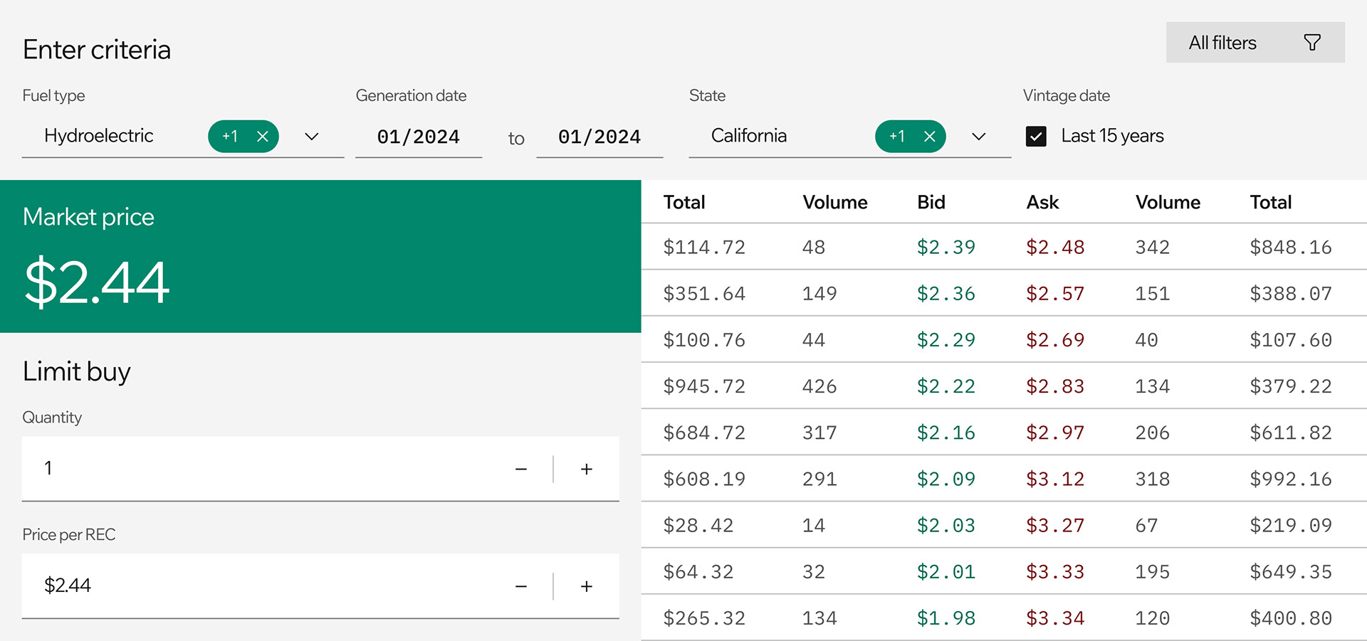
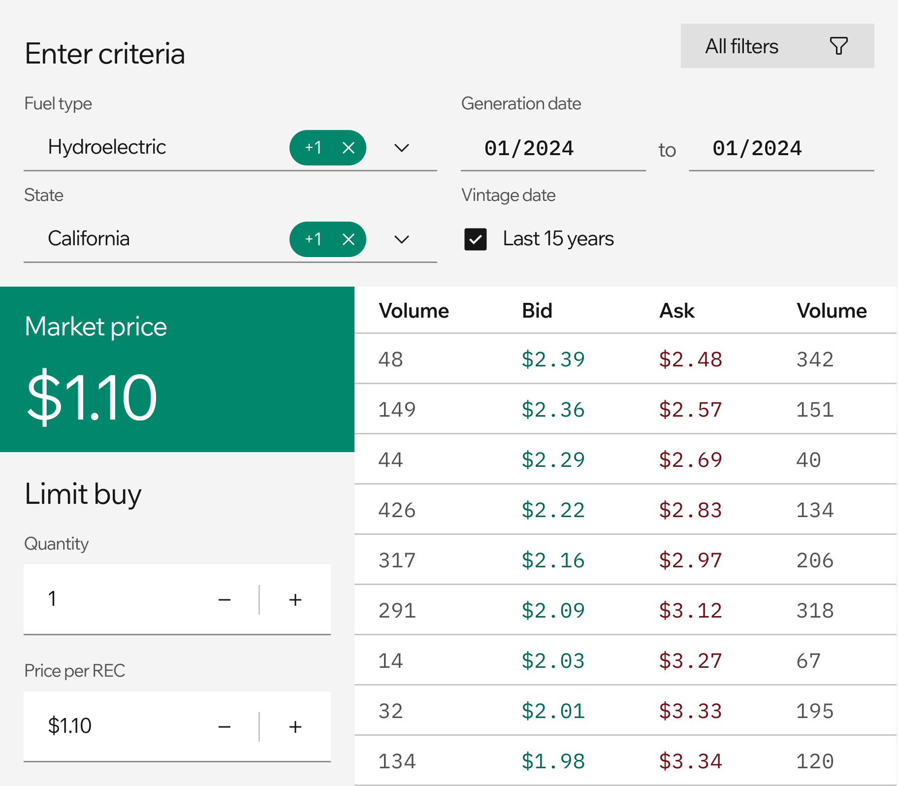
Gridify's product currently centers on a unified online marketplace with options for both Limit Buy (using a classic order book) and Bundling. The road ahead is pretty long, but we're still one step one.
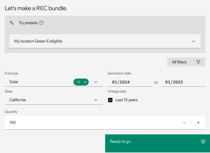
For this phase, I iterated with CEO Adhitya Jayasinghe daily to solve existing painpoints in the REC purchasing process. What popular filters can be combined for a "one-touch" preset? What is the financial literacy of purchasers in the sustainability departments of big companies?

Building a brand from nothing
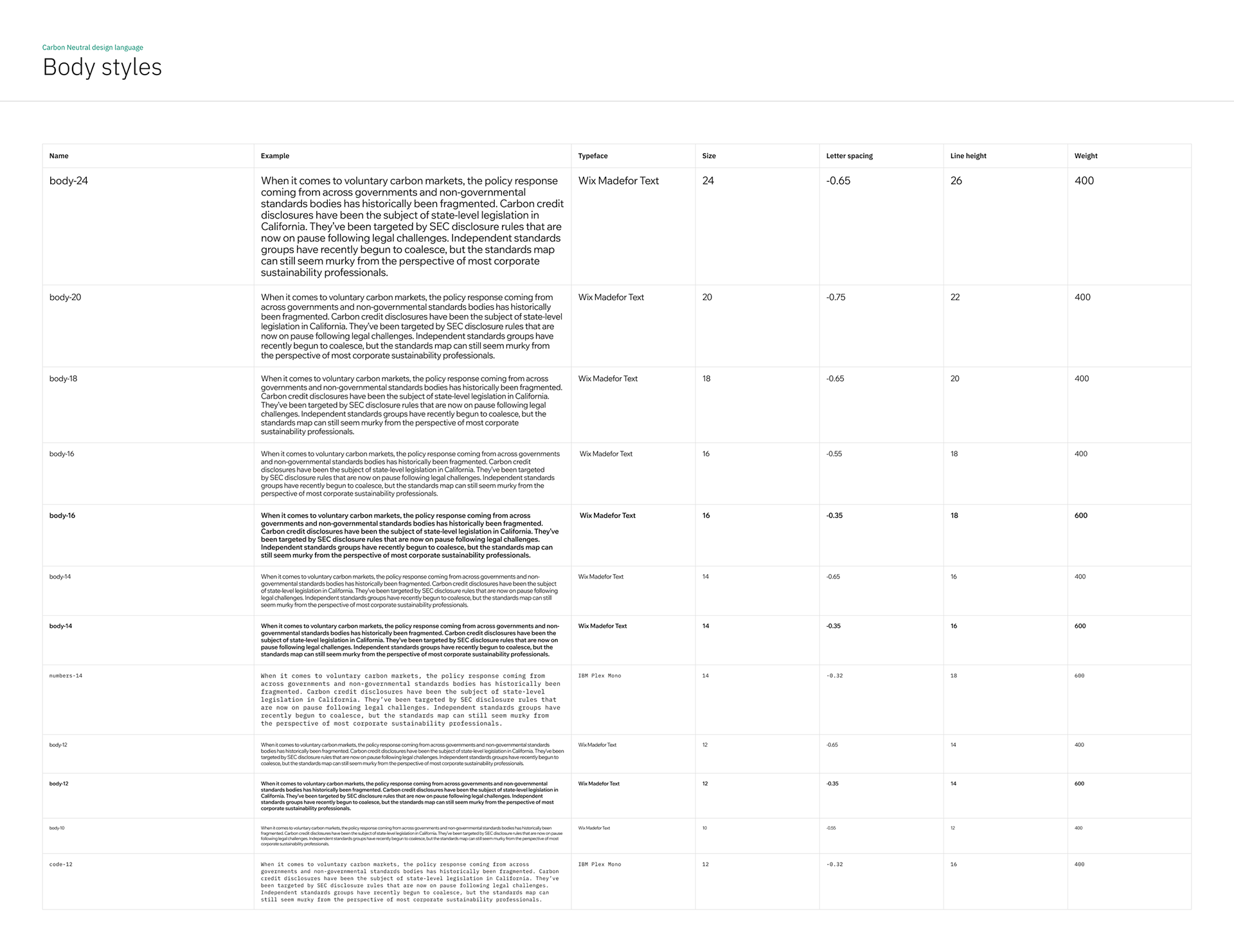
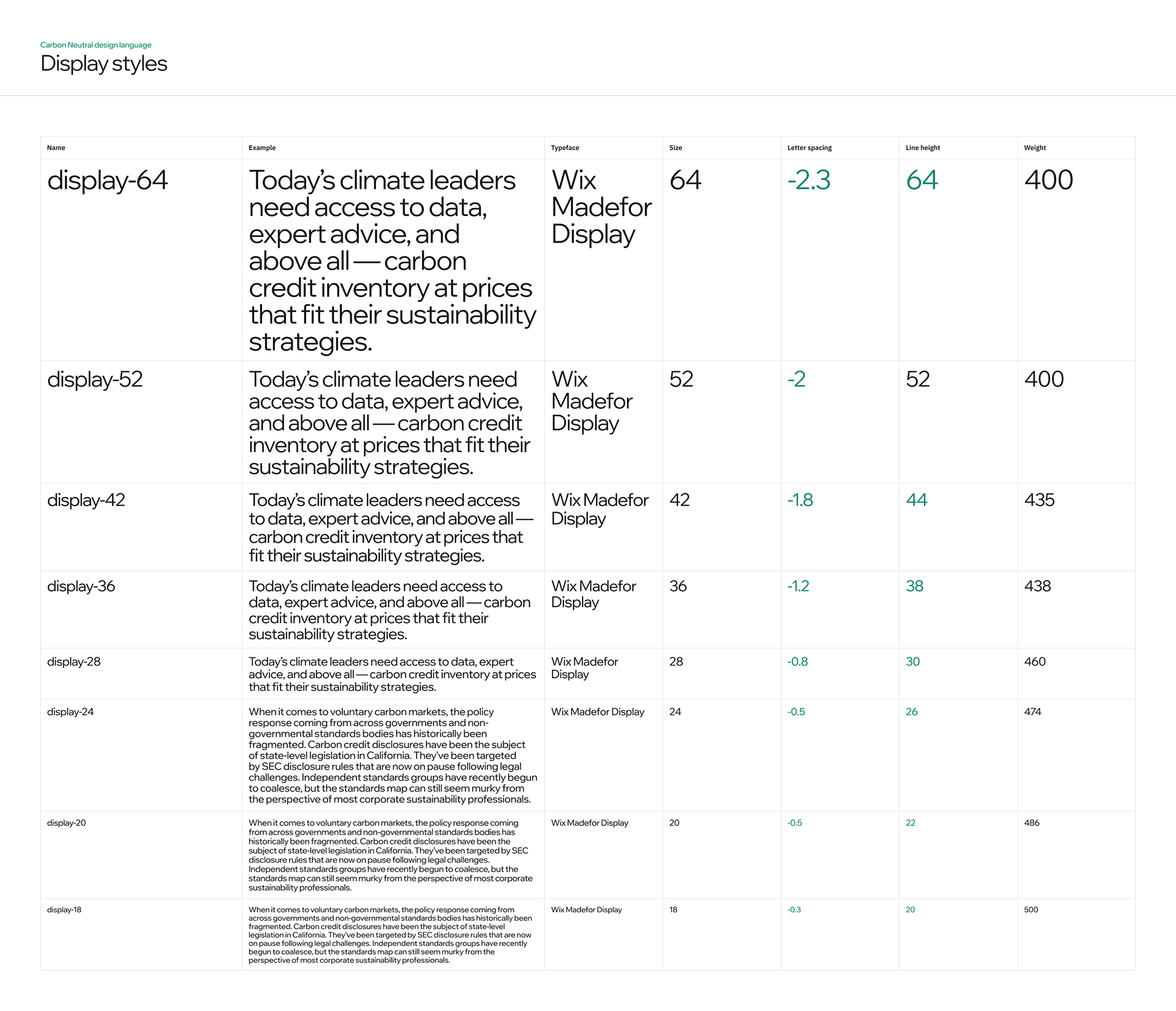
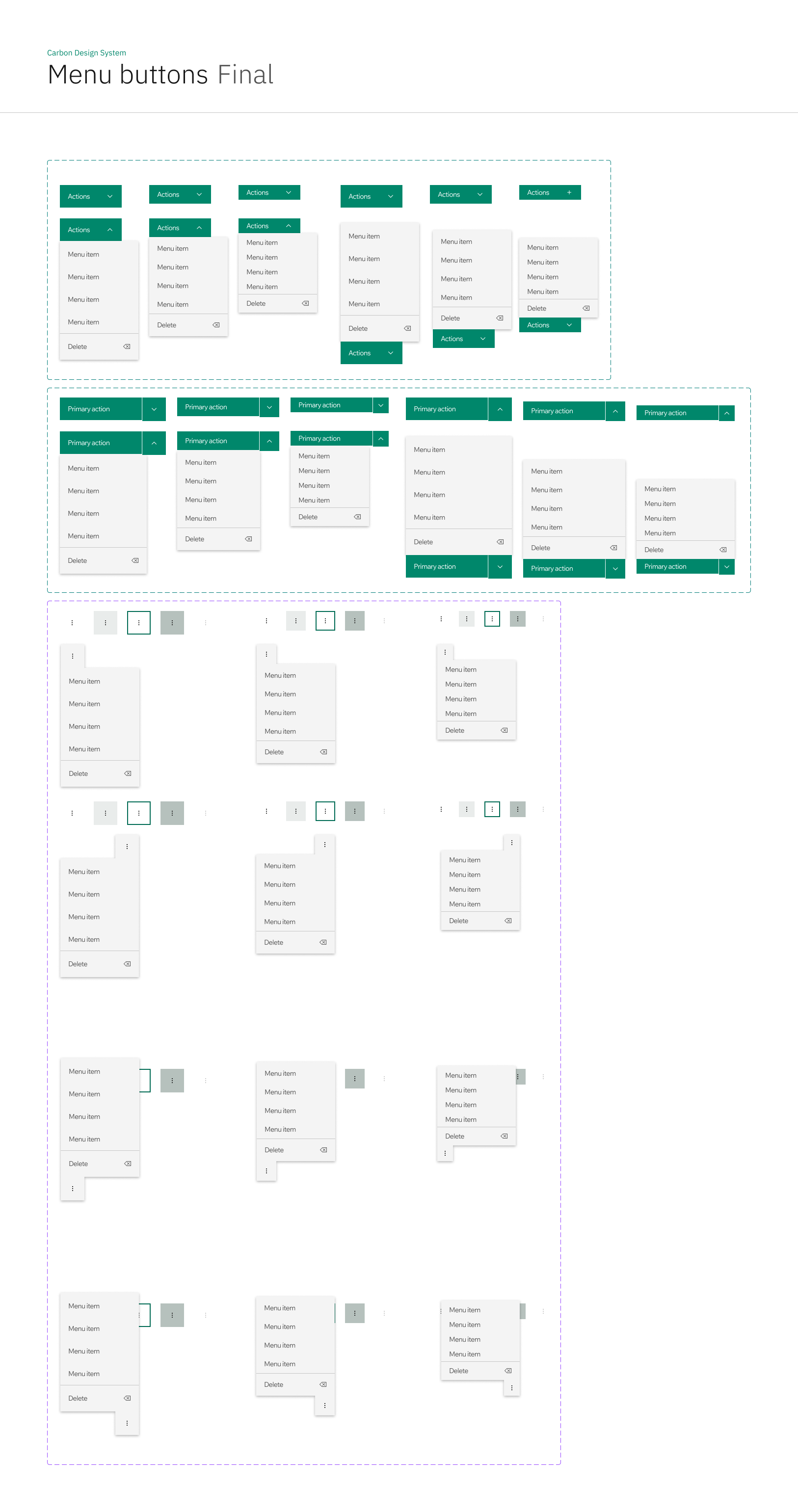
Today, our product uses a custom refactor of IBM Carbon that we've called "Carbon Neutral" (get it?).
IBM Carbon is a design system that is robust enough to handle compact dataviews and standard commercial processes, while also boasting one of the most mature and beautiful data visualization libraries in the industry.
Its boxy, modern styling with no padding and minimal space waste mirrors our values of no-nonsense simplicity and efficiency.
Someday, we'll build our own design system, but for now, Carbon Neutral punches above our weight.

Below are some snippets of our logo building process. We knew we wanted an "icon and text" logo for flexibility — we could imagine someday these assets belonging on physical print reports, or a T-shirt, but also as a 32px favicon, or an email signature.
There are lots of directions for climate tech branding: sun imagery for growth and power; grid imagery for reliability and strength; earth imagery for unification and humanity. I ended up picking an icon (top left option) that was closer to the pupil of an eye: always watchful, ready to act, and technologically vigilant so that we can stand at the foreground of climate policy.
The sundial-like partition of the circle nods toward our goal of implementing hourly Renewable Energy Certification: if there is no solar power at 11pm, a company should not be able to claim their energy consumption at 11pm comes from solar power.


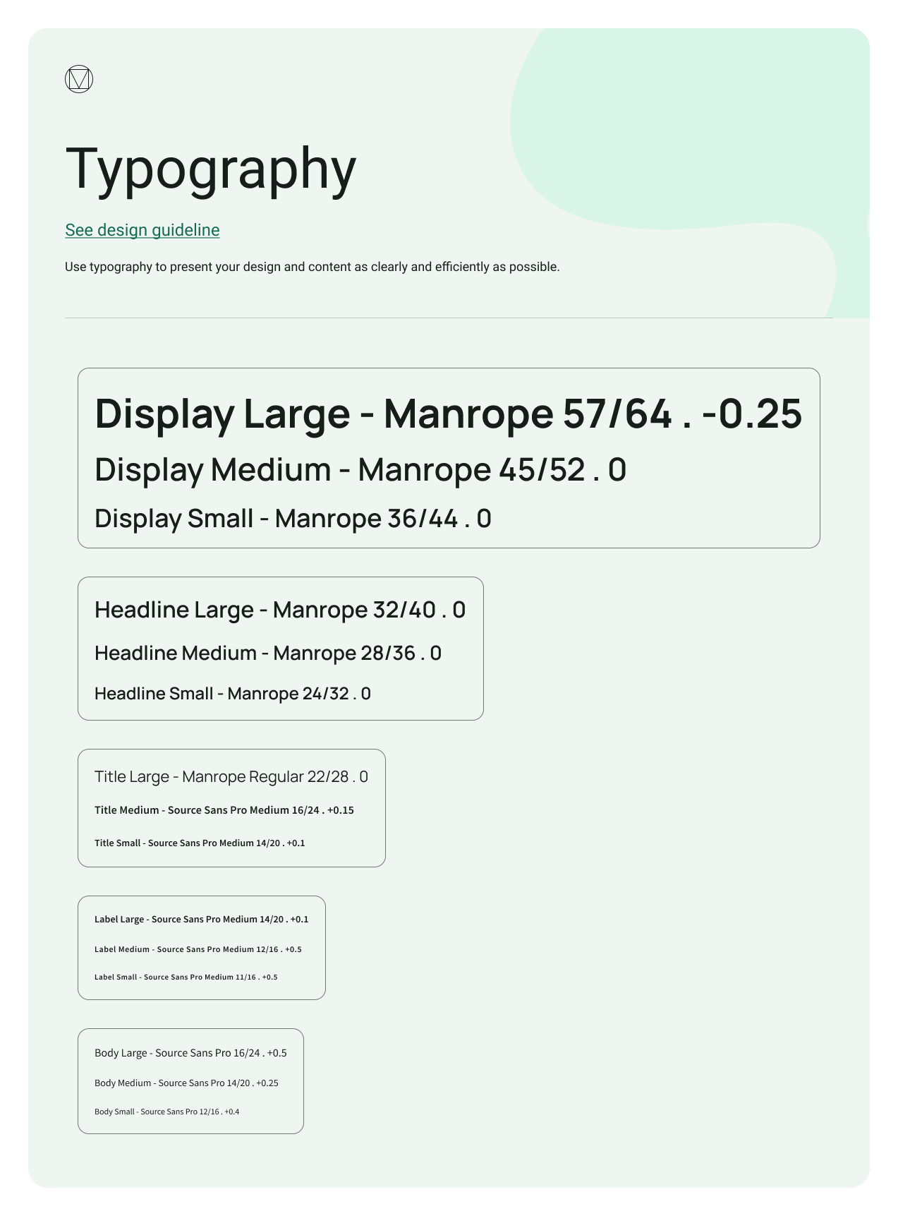
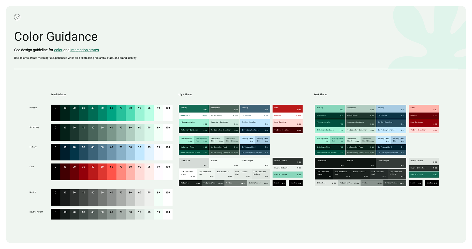
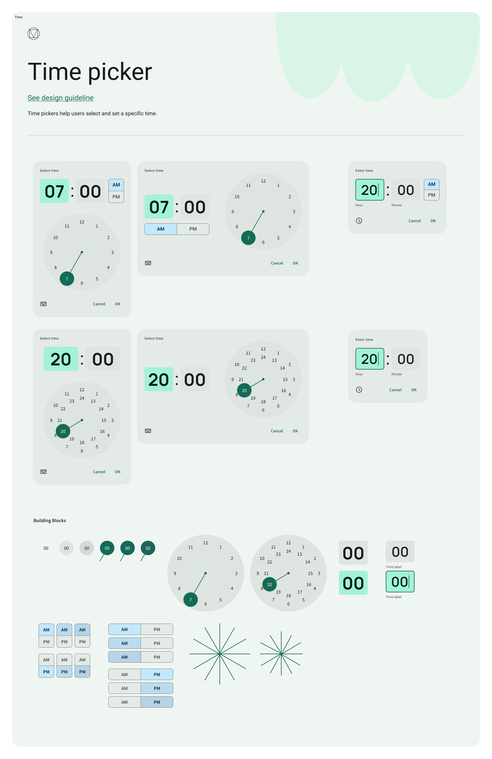
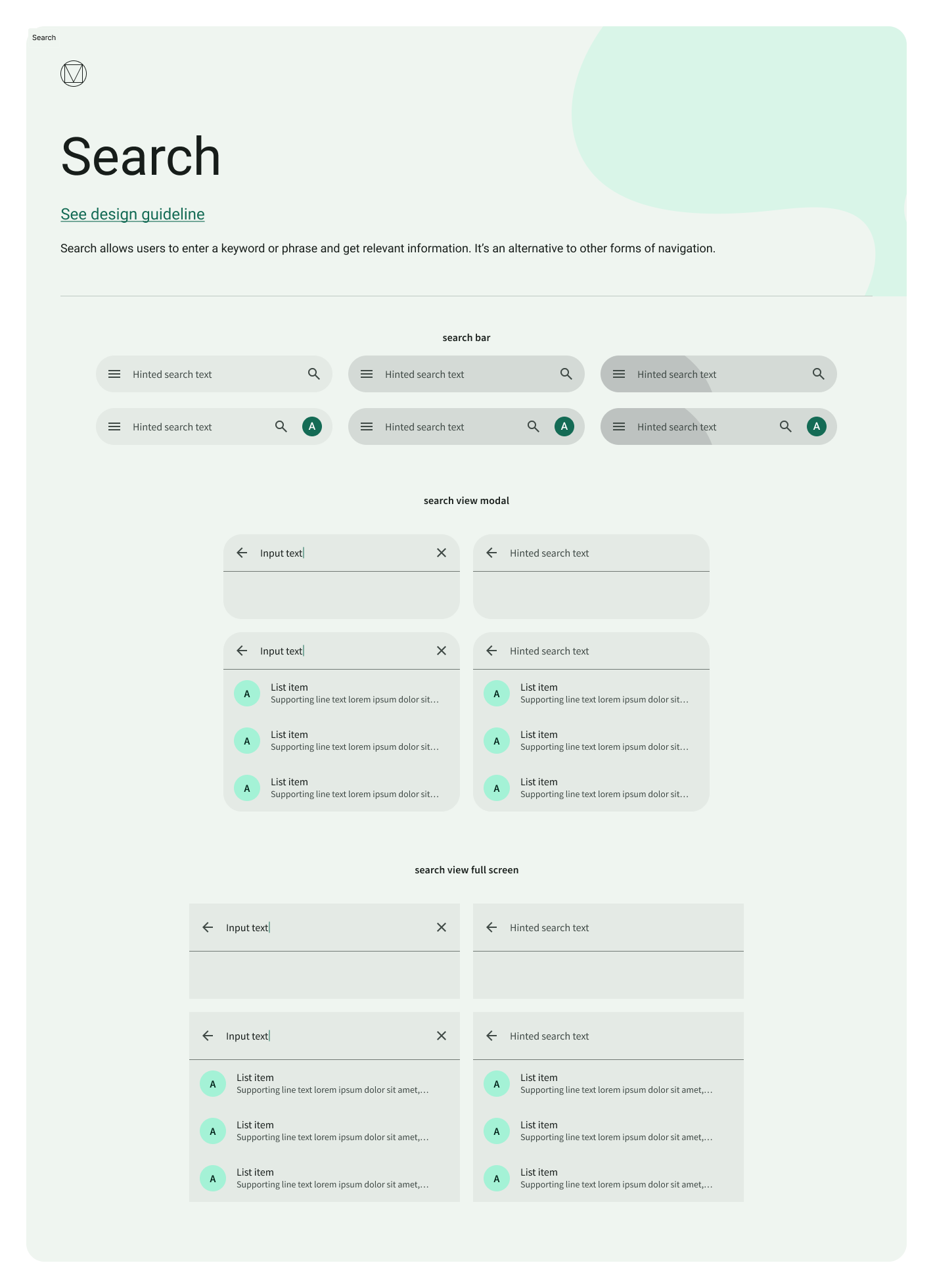
We didn't always have such clean and clear brand direction. We began by using a modified version of Material UI, Google's UI kit. We wanted to hit the ground running in terms of development, and MUI is one of the best options to do so. You can see some of our mockups below.
Pretty quickly, I began to feel that the component options (especially the navigation options) lent a lot of space waste to the designs, with curvy, consumer-oriented containers that felt counterproductive to a business tool. At first, I migrated just the navigation to a different design system (I really liked the compact nature of Atlassian sidebars — see third image below), but I soon realized the whole site (and branding) needed an overhaul.
I felt like I couldn't breathe when designing, so users would definitely feel that sort of "itchiness" while using it.
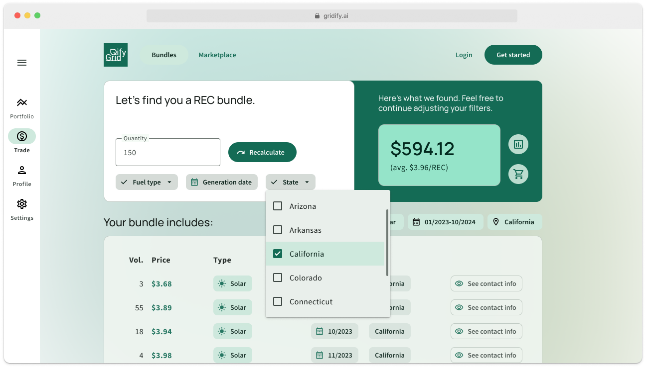
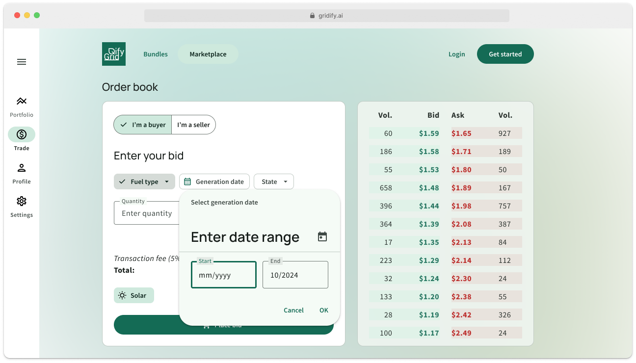
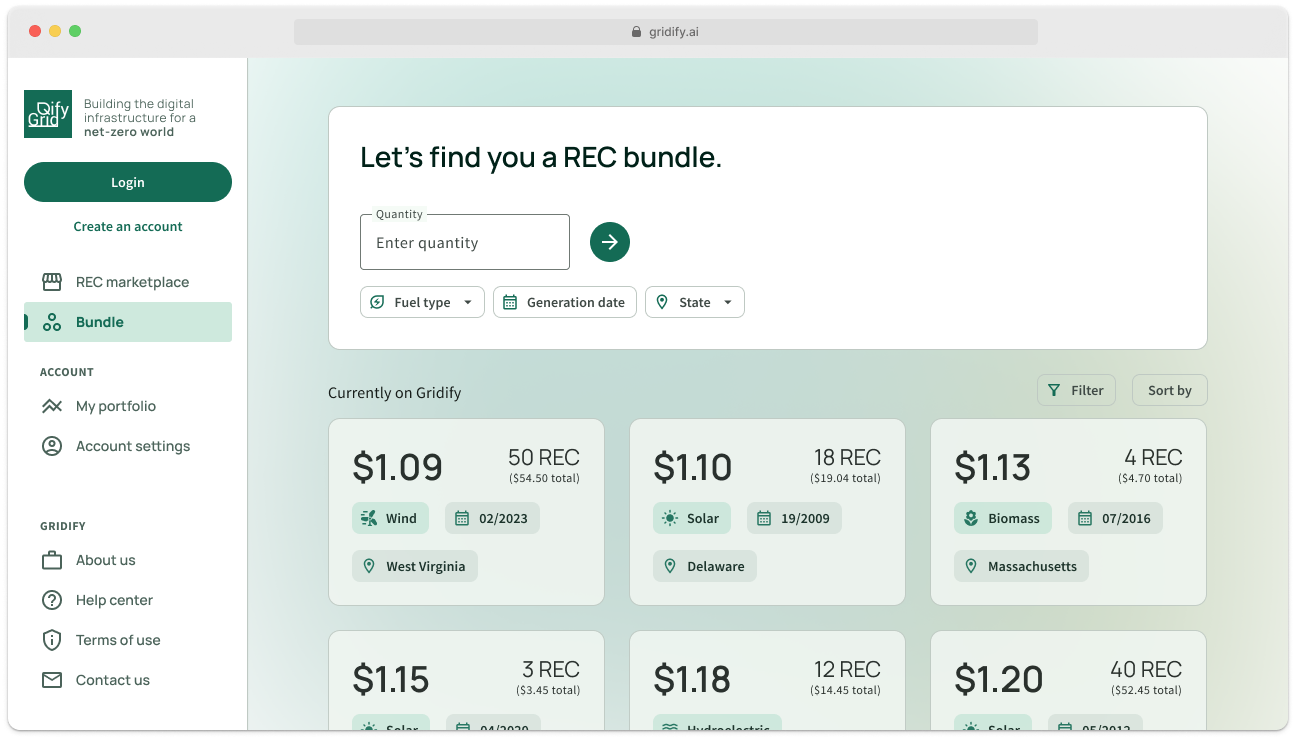
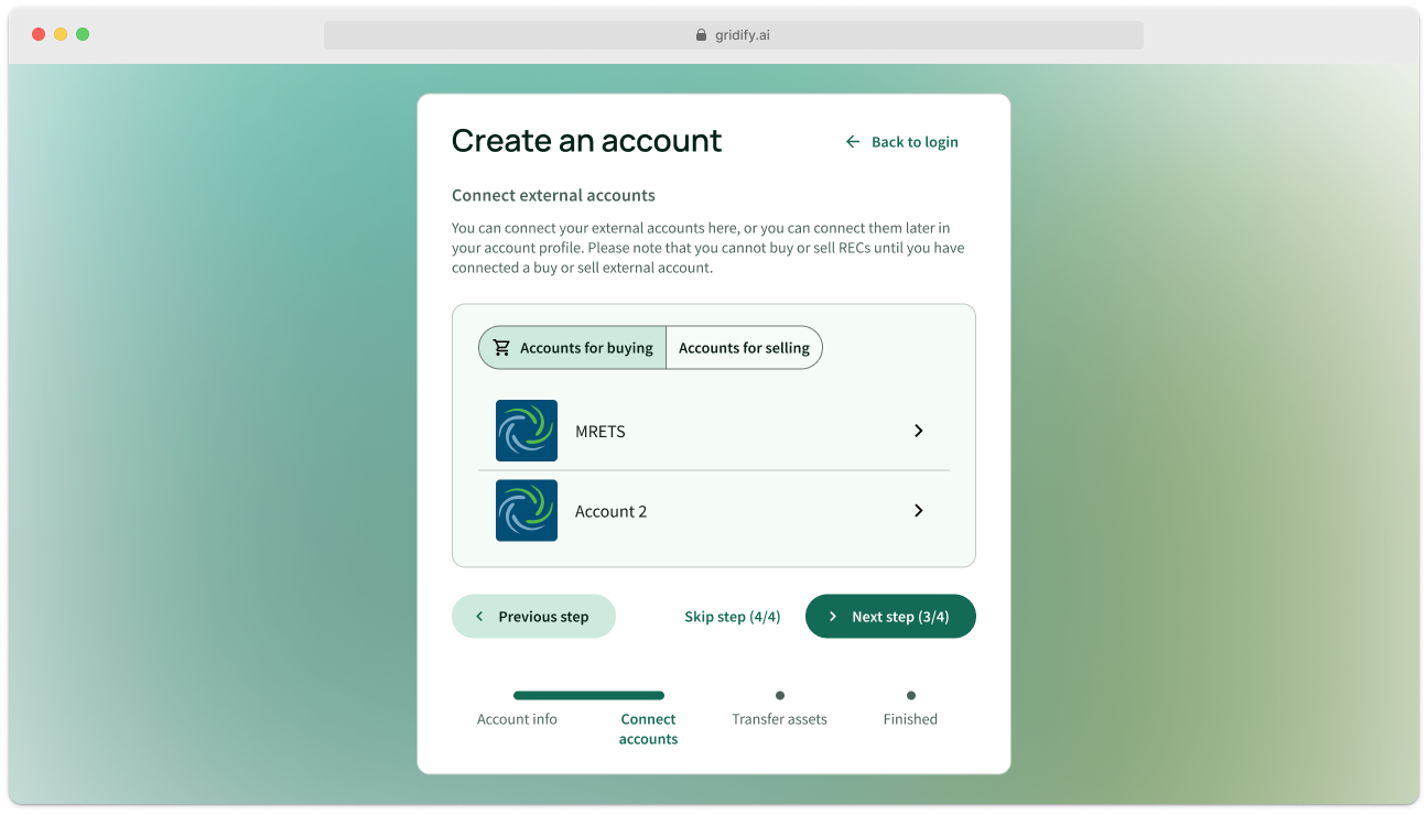
But it was still a great experience in learning how to use MUI, a toolkit I'm sure I will use as a base for designing other, perhaps more consumer-oriented products. And the color palette that the Google branding plugin for MUI generated has remained with us today, even after the transition.
