Now baking... Red Velvet!
As of October 2023, I have been working on developing my very own sub-system of Cake, called Red Velvet.
A little taste of Red Velvet.
With all the knowledge I've gained from working on Cake with my design colleagues, I've been architecting Red Velvet from the ground up for a whole new user base.
Red Velvet uses the foundational tokens of Cake (hence why it's a "sub-system") — but owns a totally fresh set of components & variants, since it is geared toward B2B cloud-based apps, such as Lenovo Device Manager. These apps, while being more commercial-facing, could still use a consumer-friendly design rehaul.
One of the great things about designing a sub-system that relies on the Cake tokens I architected previously is that dark mode is essentially built into the components. This is super handy, as Microsoft is pushing for dark mode as an accessibility requirement for applications in 2025.
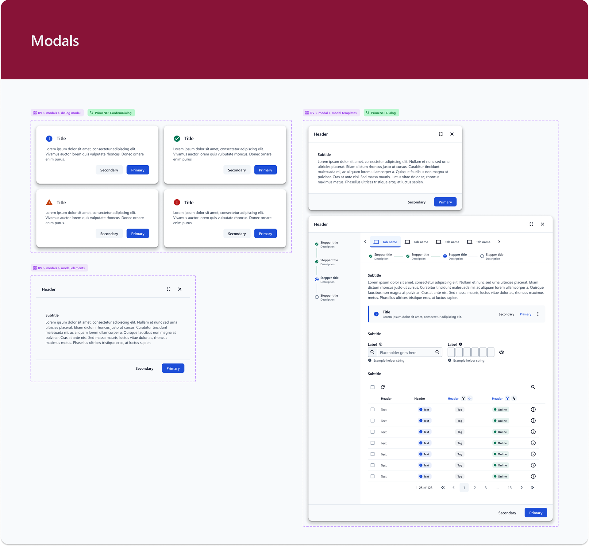

Here are modal templates up close. The component may be original, but its dependency on Cake color & type tokens means that it inherits theming as well!
Back to Atomic Theory.
Red Velvet use case 1: Lenovo Device Manager
One of my first applications of Red Velvet was testing a redesign of Lenovo Device Manager, one of the most popular B2B cloud apps that Lenovo offers. LDM offers IT admin a "quick-glance" method of surveying fleet health, with options to telescope into details at any level.
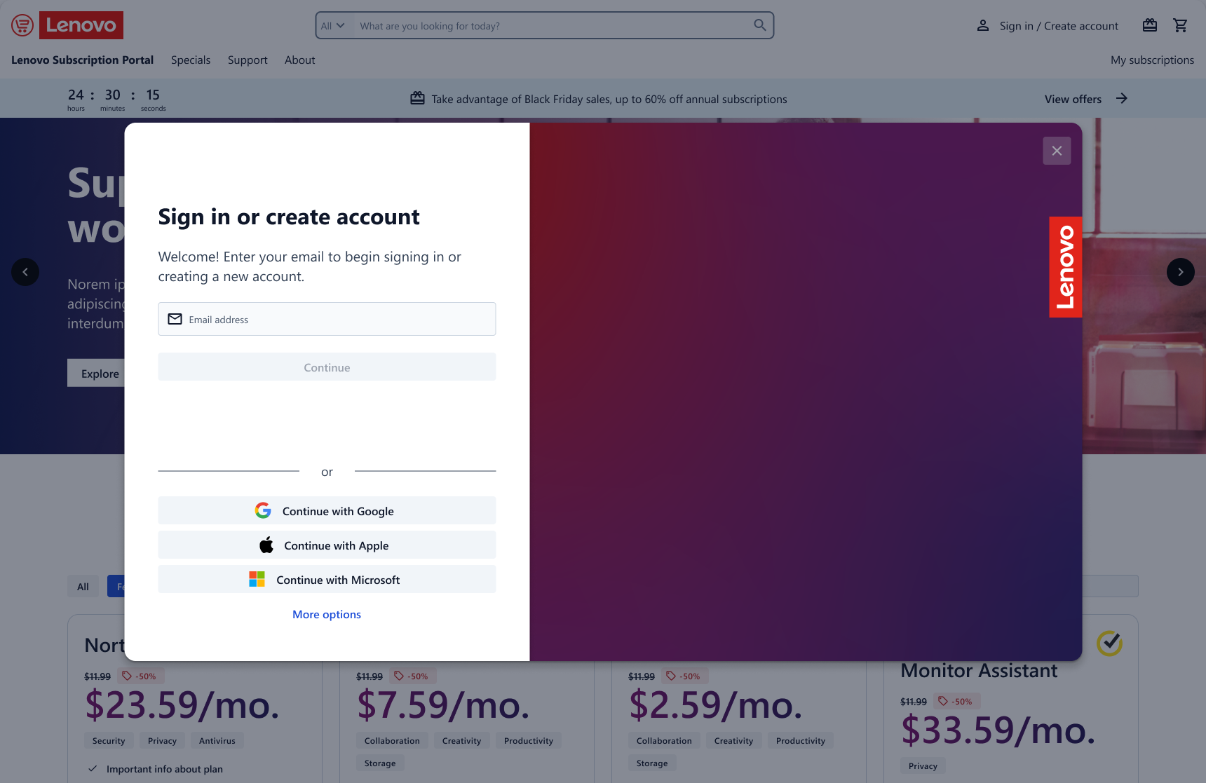
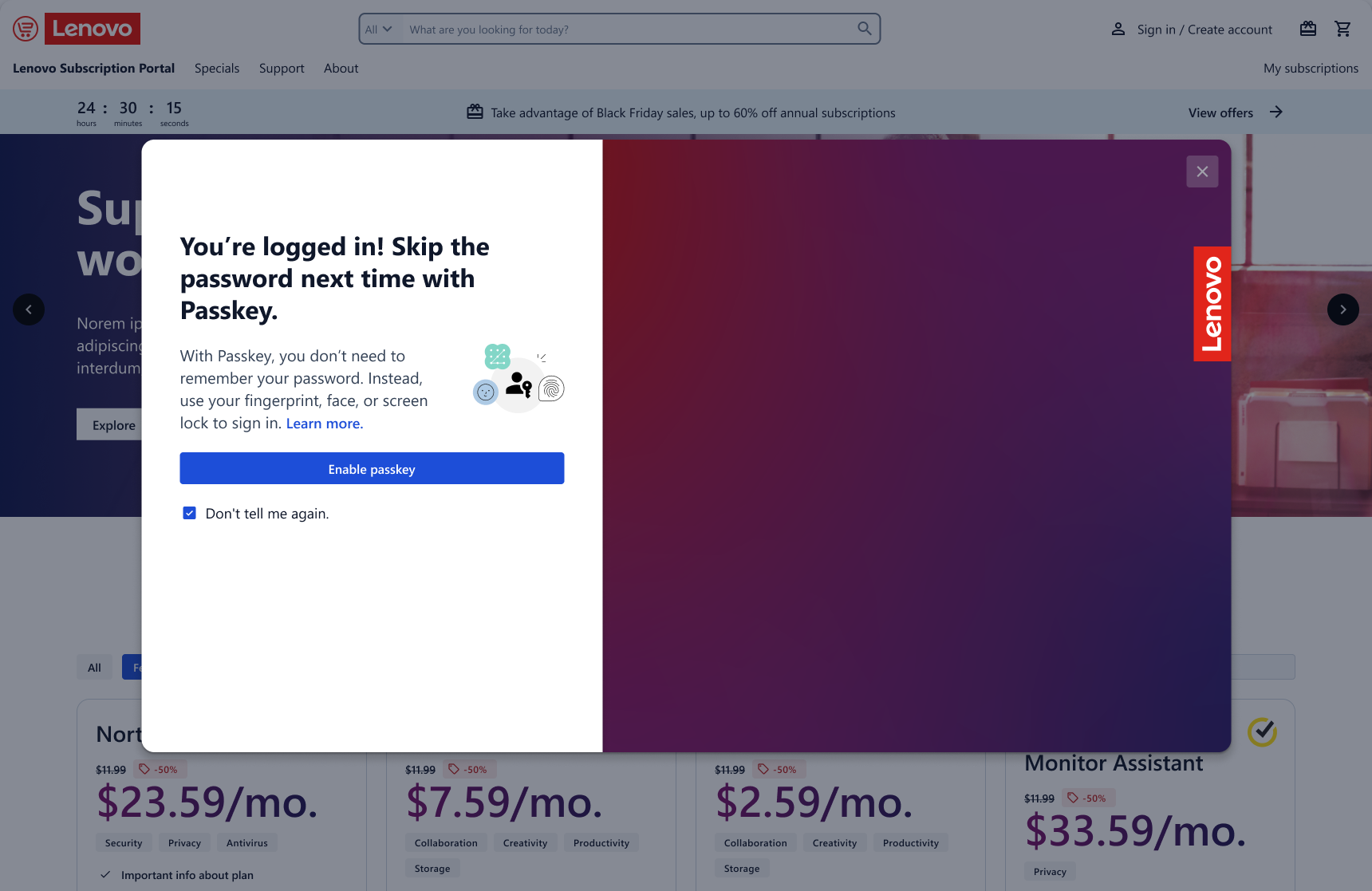
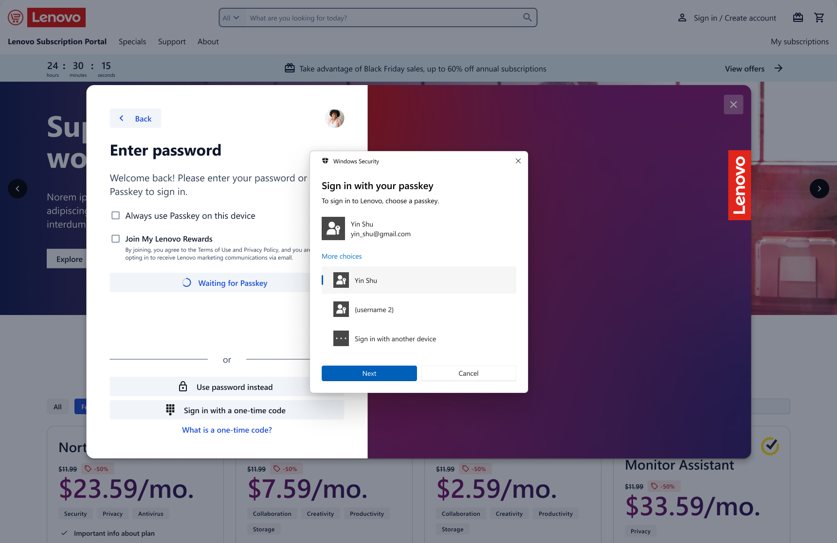
Since Cake has only been used on select Lenovo apps so far, I had to create lots of design patterns & flows from scratch, such as this sign-in flow that is now the Cake standard.
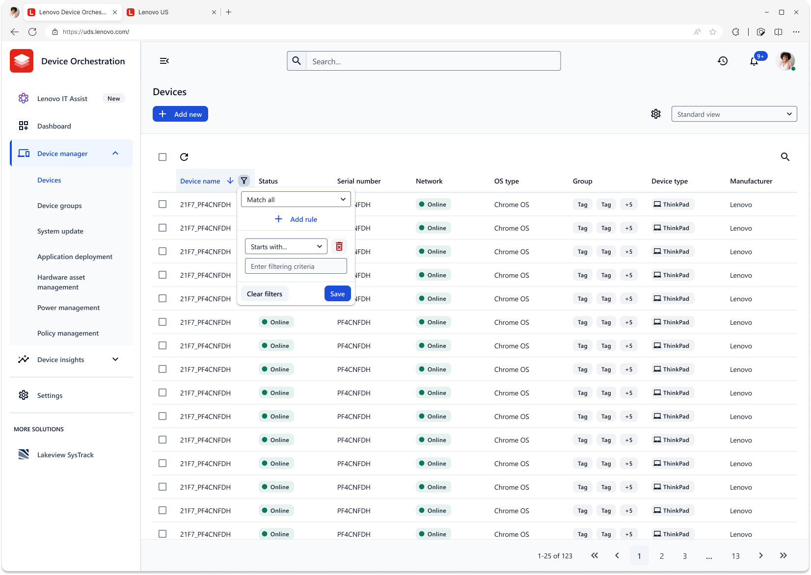
The main view of LDM is this device list. Since Cake has not yet met an application that requires lots of data visualization, I made these table templates from scratch for Red Velvet. Enhanced tags and chips provide information-at-a-glance, and opacity-based backgrounds help handle table row background variation. And, although Red Velvet uses squared buttons for a more tabular view, it retains the general modularity and card-based elevation schematic of Cake templates for "One Lenovo" consistency.


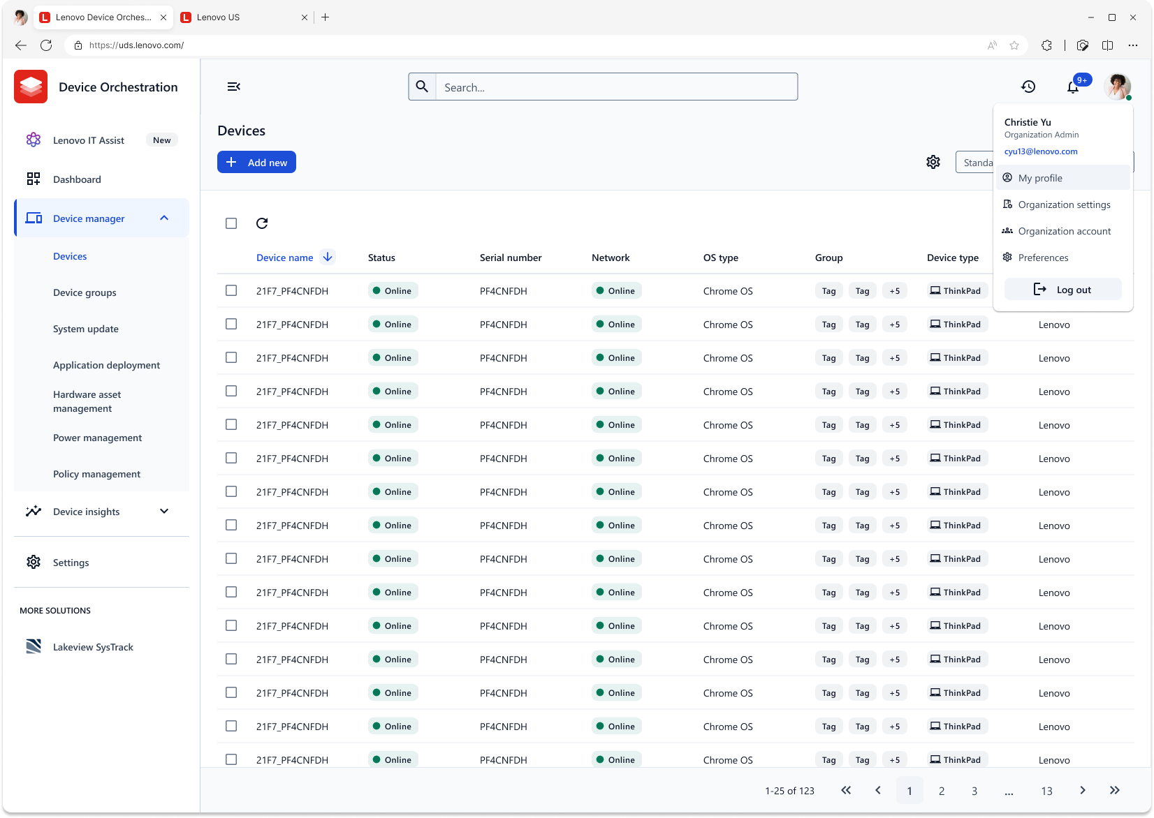
LDM also has a profile section. The user information section needed to be made from scratch, but I was able to borrow some of my past work with the Vantage app to lay out the settings pages.
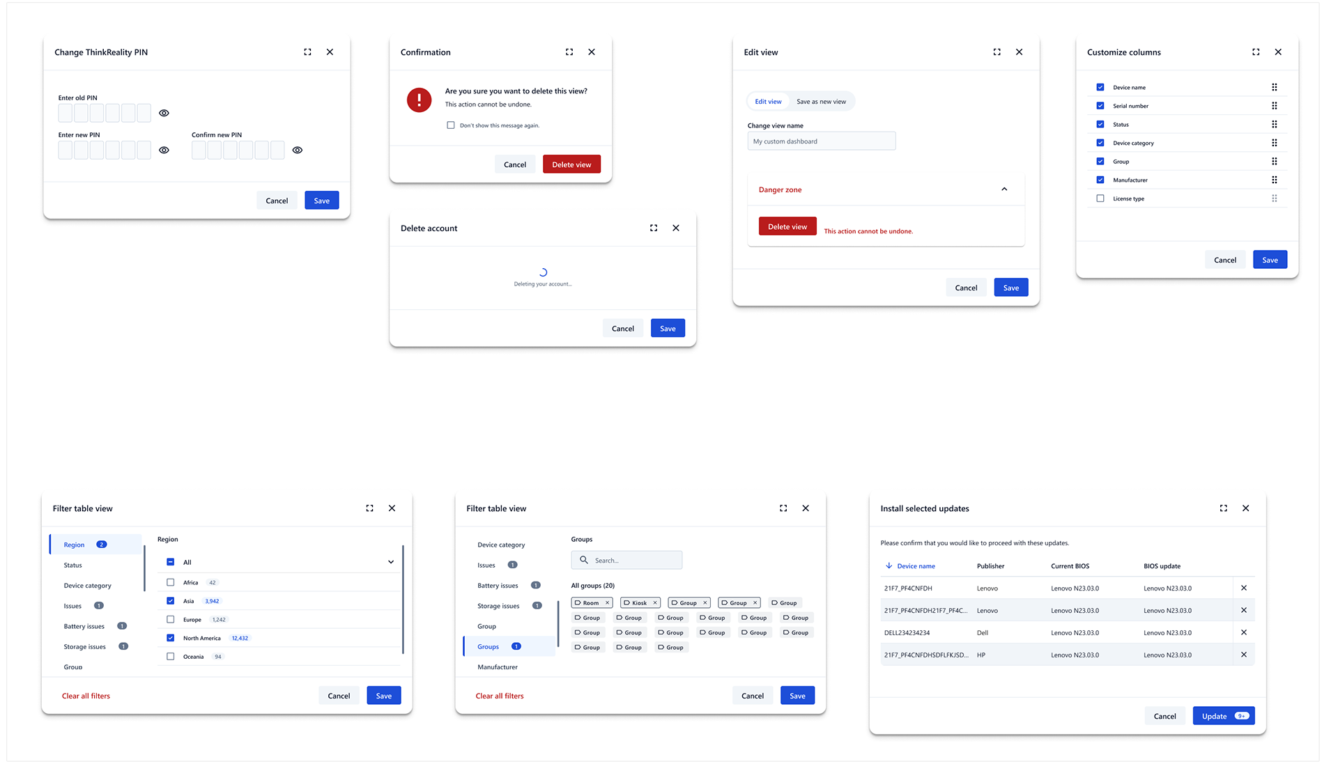
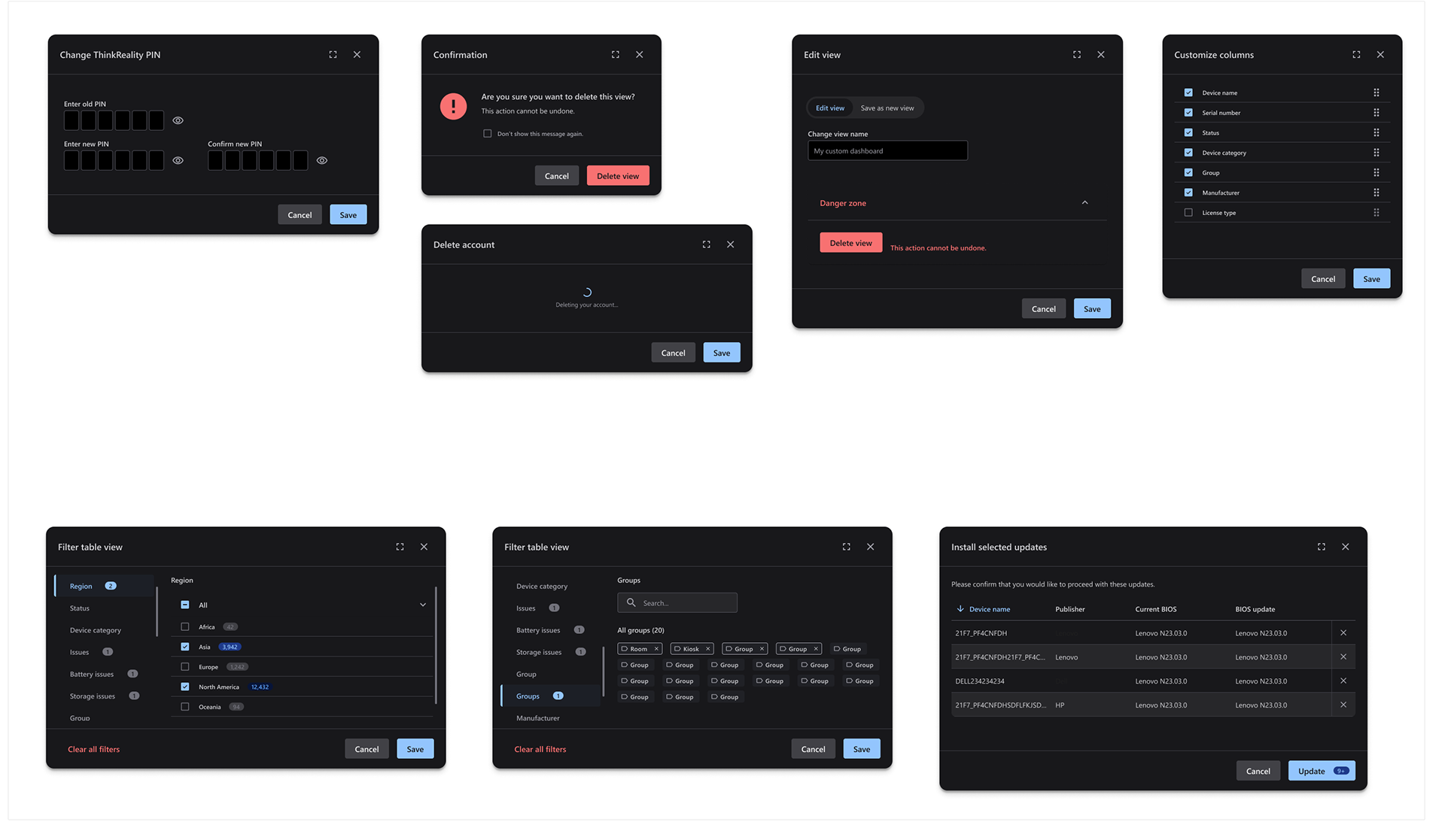
And here are some associated modals.
Here's a sneak peak at our newest generative AI app in LDM. I am the design owner for this app.
You can really tell from this side-by-side comparison how badly the design refresh was needed. Plus, we were able to add a dark mode in a snap!
Red Velvet use case 2: Classroom Companion
A few weeks after my work with LDM, the Classroom Companion team at Lenovo reached out to me asking for some help with a rebrand as well. Their case was pretty unique, as their app is not only consumer-facing but student-facing, which has its own set of design challenges. They named a few PO requirements to me, such as promoting a chatbot view, which was intended to aid students as they listened to online course recordings. This chatbot was silo'ed into each course; the "Precalculus Companion" could not answer questions about Biology, for instance, and they wanted to make this clear visually.
As Red Velvet did not have an existing chatbot component (Lenovo has many AI apps in the works right now, but none based on the Red Velvet design system until this product), my first task at hand was to consolidate some past Lenovo chatbot views to create a "One Lenovo" standardized component.
As Red Velvet did not have an existing chatbot component (Lenovo has many AI apps in the works right now, but none based on the Red Velvet design system until this product), my first task at hand was to consolidate some past Lenovo chatbot views to create a "One Lenovo" standardized component.
I used the four references on the left to create the chatbot component on the right. The leftmost reference image was a mockup given to me by the Classroom Companion team.
You can see that my chatbot component integrates seamlessly into Red Velvet spreads, in both light and dark mode. I renamed the companion to "Precalculus Companion" to show even more clearly that the chatbot is silo'ed. Of course, that heading will be replaced for future applications of the chatbot component outside of Classroom Companion.
After creating the chatbot component, the rest of the redesign was fairly simple. Here is the final comparison, with mockups from the Classroom Companion team on the bottom row and my redesigns on the top row.
One of the important UX guidelines I enforced was minimizability of the chatbot component. Even though PO's wanted as much promotion of the chatbot as possible, I maintained that students must be able to minimize it to stay focused in certain scenarios. As a compromise, we settled on keeping the chatbot open on default and providing a minimize button that shrank it into an avatar. You can also see that I customized the color of the "Precalculus Companion" icon to further demonstrate its silo'ed nature. Finally, I changed the course dashboard to provide space for more class specs, and color-coded each class to provide a sense of encapsulation per course. I also added potential to access archived course content.

