Architecting Cake: “Baking” a design system from scratch
Most people are familiar with Lenovo as a hardware company. But, as Lenovo moves deeper into the device ecosystem space — producing tablets & Motorola phones on top of its famous “Think” PC line — its enterprise software apps (Lenovo Vantage, Lenovo Freestyle, Legion Gaming, Motorola Ready-For) are more and more what customers “feel” when they think about Lenovo.
It makes sense, then, that as part of the newest "One Lenovo" push, one of Lenovo leadership’s major priorities is unifying Lenovo’s software design systems.
I was lucky enough to get the chance to push that project forward when I rotated onto Diana Gerli’s Software UX team in Lenovo’s Intelligent Devices Group (IDG) in February of 2023. Her team has done amazing work, like transforming old-style Vantage into “new” Vantage, using their new design system, Cake, on Figma.
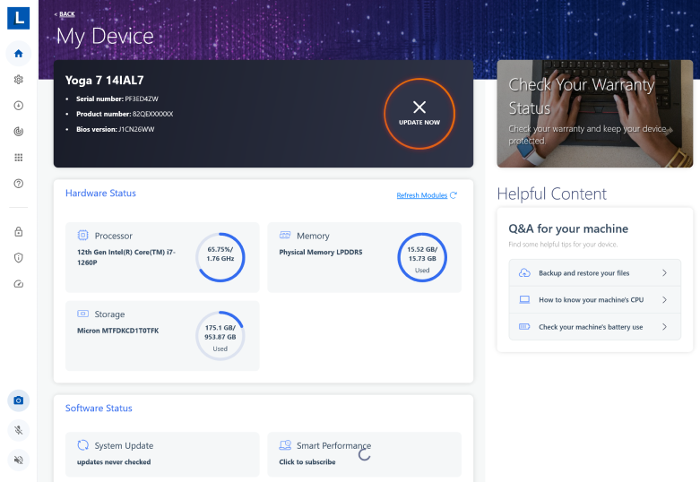
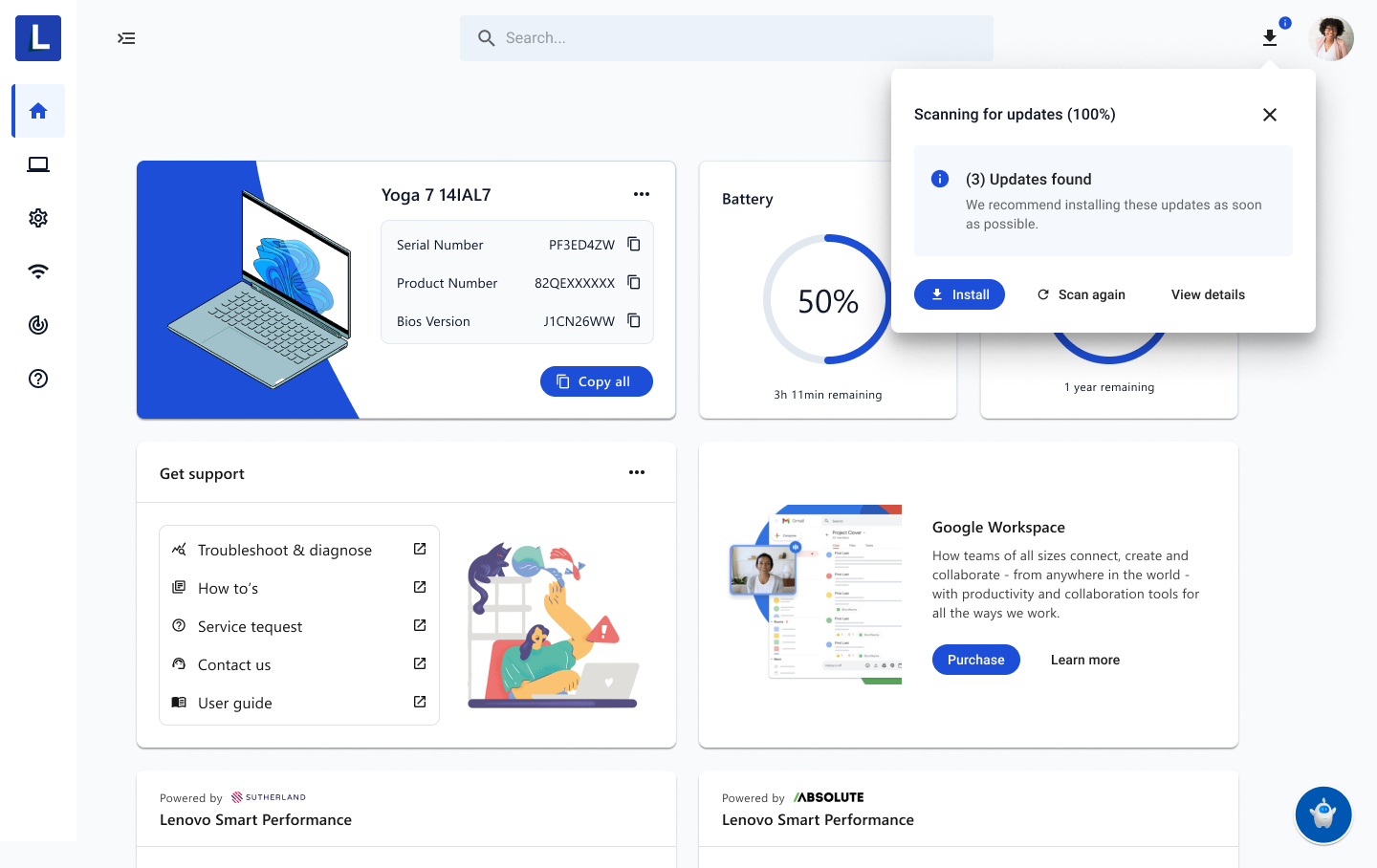
Vantage is an onboarding app that comes with all Lenovo devices. It has over 3.3 million usership per day, largely in the China geo. It helps monitor device health and has immediate support for Lenovo-related services, like warranties and parts purchases. It has badly needed a design overhaul to match Lenovo’s vision for innovation.
I arrived onto this project when the dashboard above had just been released for production by Software UX. Much of my work on the team focused on redesigning Vantage settings, which makes up the largest portion of Vantage functionality – not only “reskinning” it, so to speak, but really investigating current consumer pain points and inefficiencies with the app.
In doing so, I quickly realized that we needed to progress Cake – as of then only a partially fleshed-out design system – to keep up with the speed at which we were remaking Vantage. Not only that, some major systemic infrastructure work had to take place.
Along with my co-architects Mike DeMar and Mallory Schultz, we formed a 3-person hyper task squad establishing foundations and components of Cake, working in parallel as we tackled major Vantage tasks.


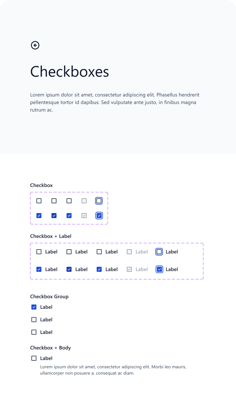
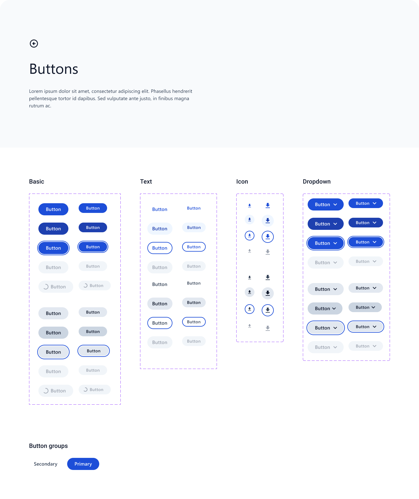
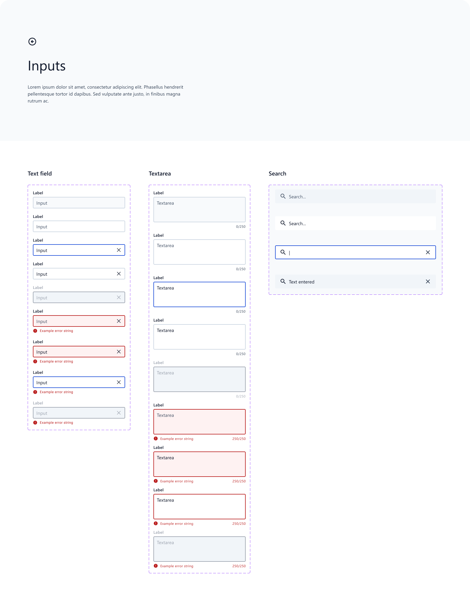
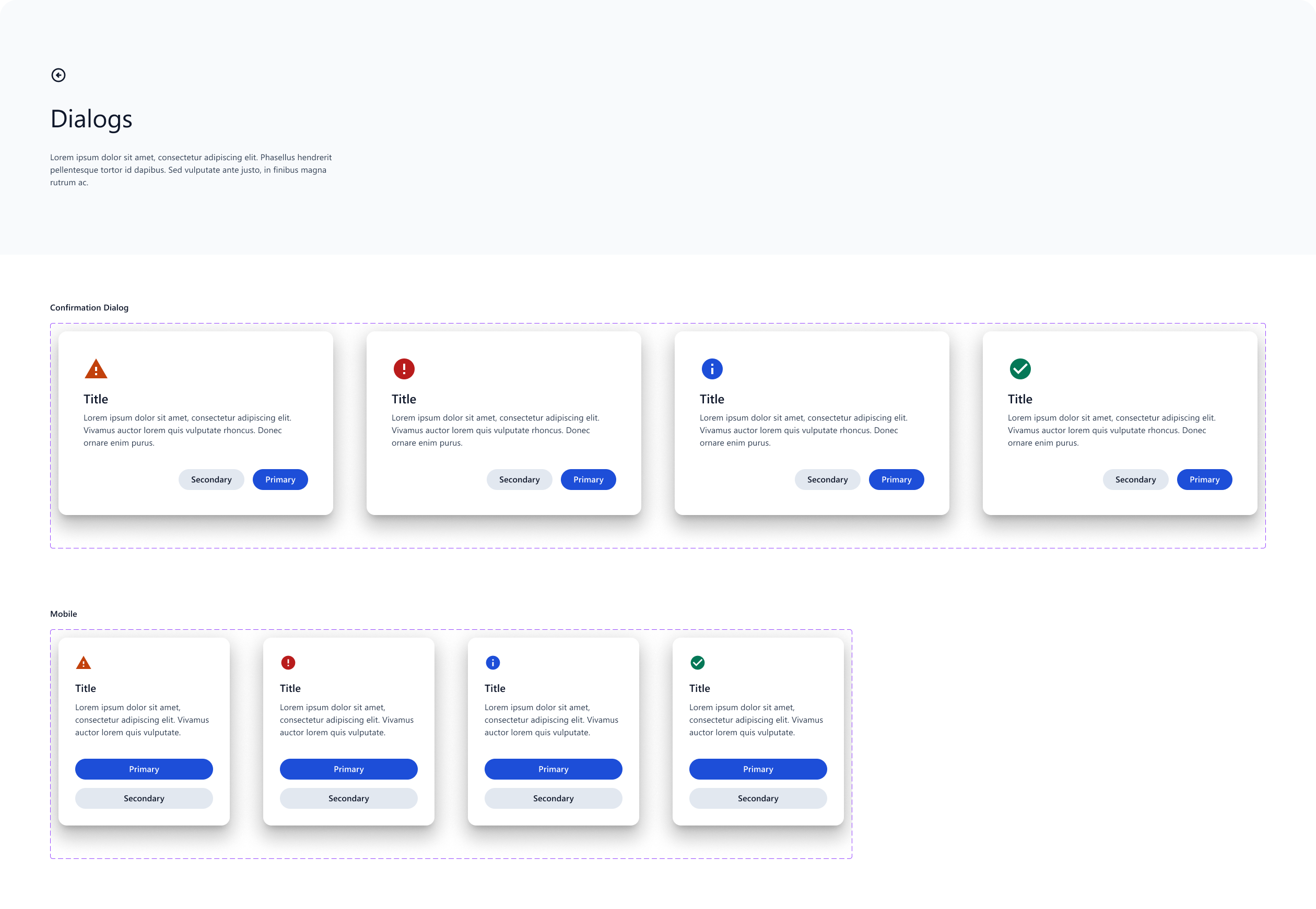
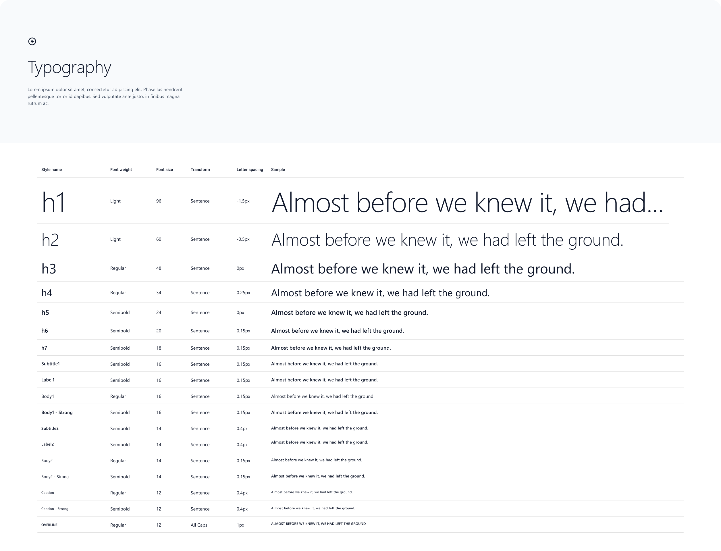
Being a UX architect involves a somewhat different skillset than a visual designer, interaction designer, UX researcher, or UX writer. I called upon my front-end engineering skills to coordinate closely with our development team, creating pipelines from Figma to GitHub and GitHub to documentation. We experimented with platforms like Storybook, ZeroHeight, and Docusaurus. Each token we created was not just a design choice but a design product – optimization & longevity were always at the forefront of our minds as we developed this design system from the ground up. In many ways, we were product owners as well as designers.
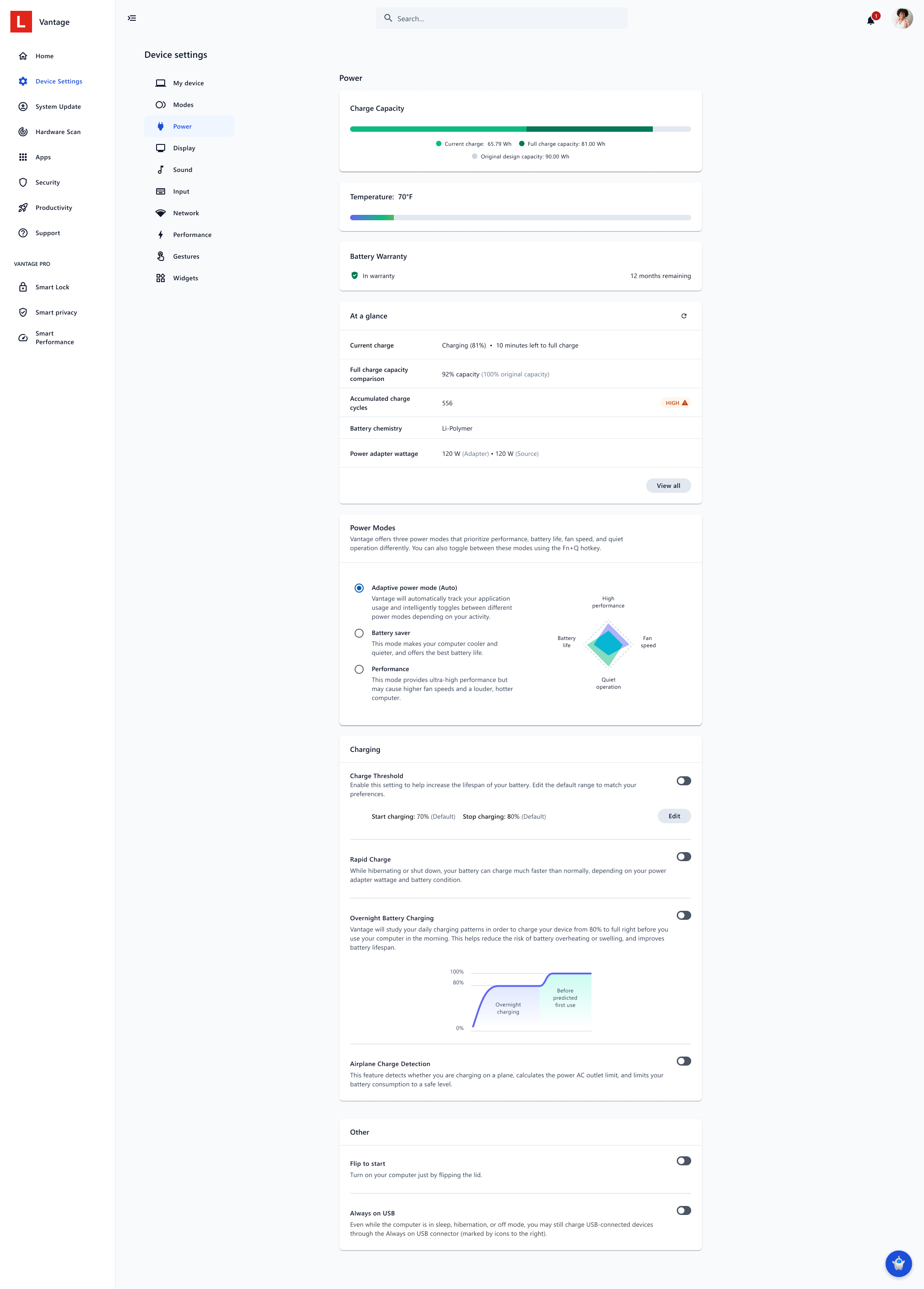
Use Case 1: Vantage Power Settings redesign
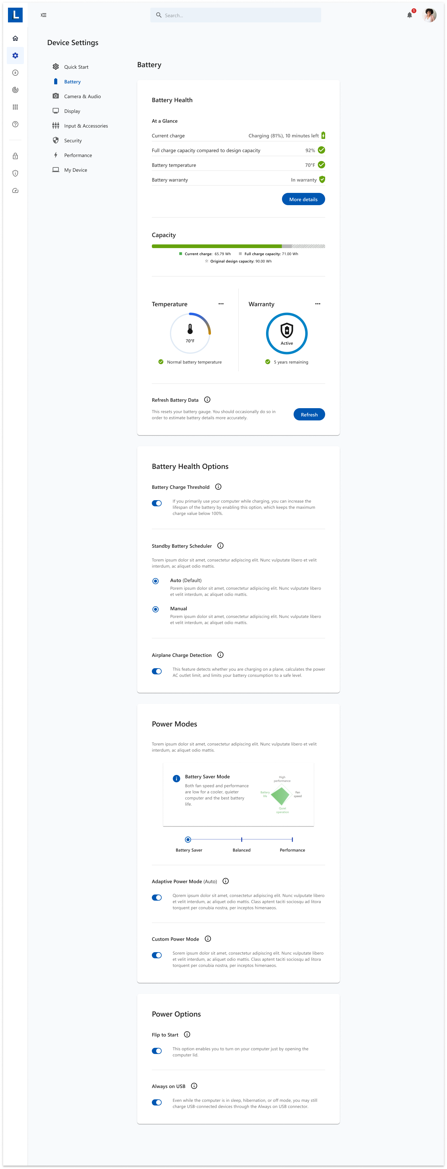
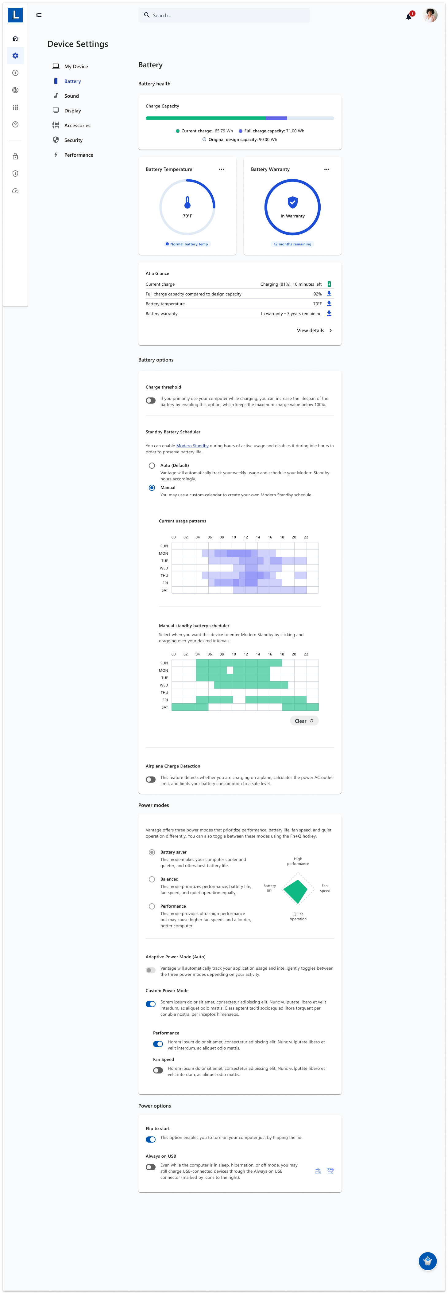
Power is one of the most complex settings pages on Vantage. With huge variety between PC verticals on what “smart power” settings are offered, what types of battery warranties are possible, what kind of battery metrics are measured, etc, the Power page required a lot of consideration for modularity, customizability, and clarity.
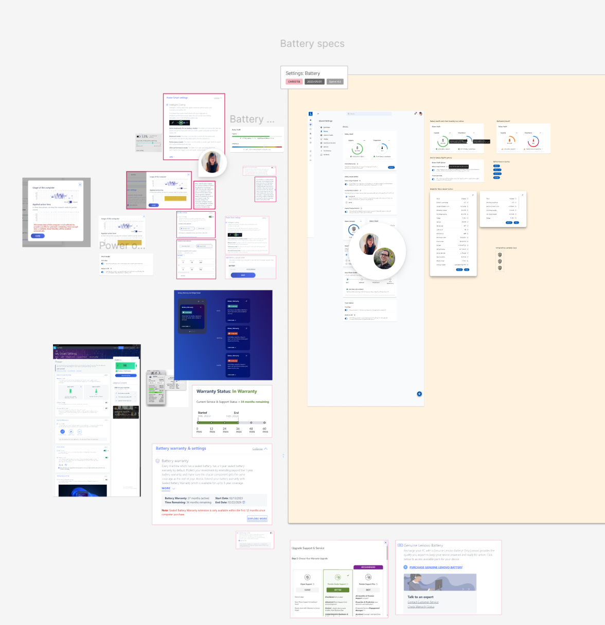
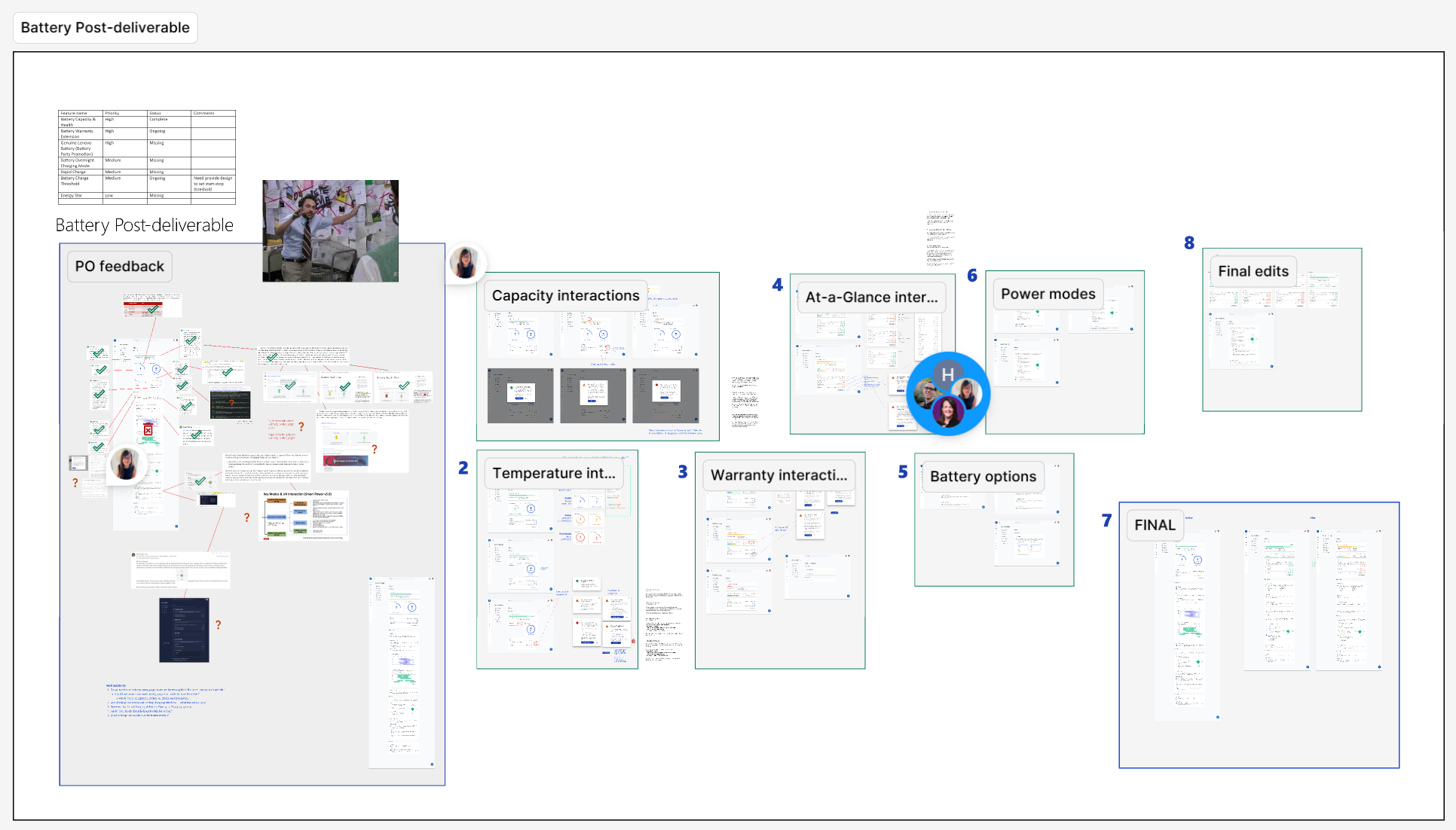
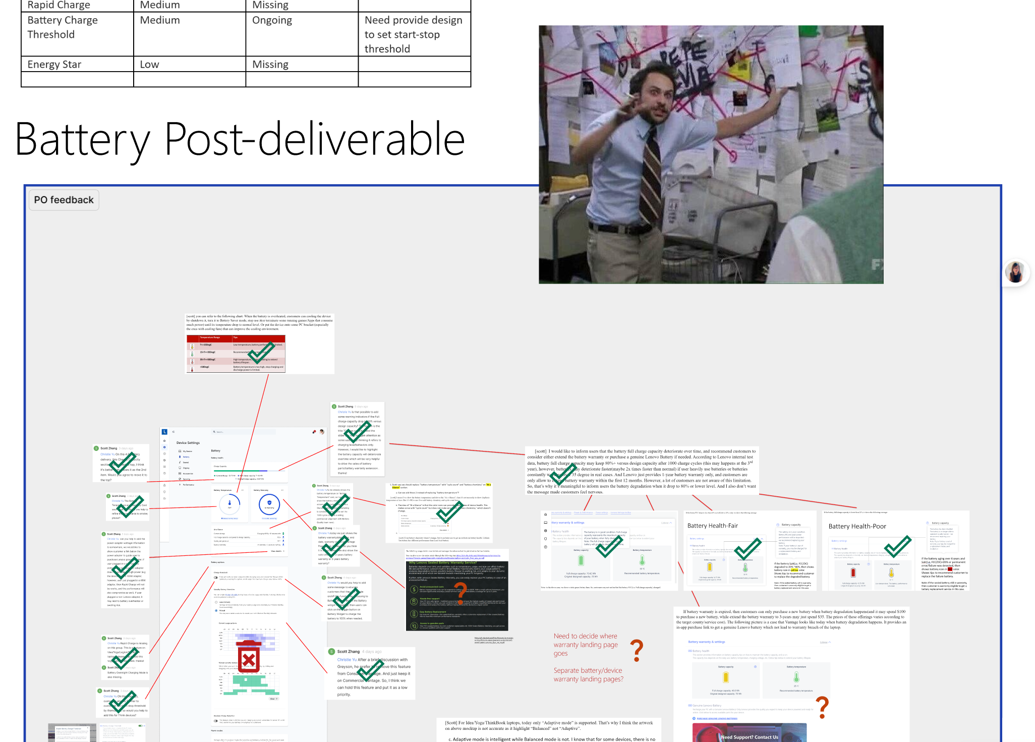
Our drafts & iteration process looked something like this:
And here’s what we finally came up with.
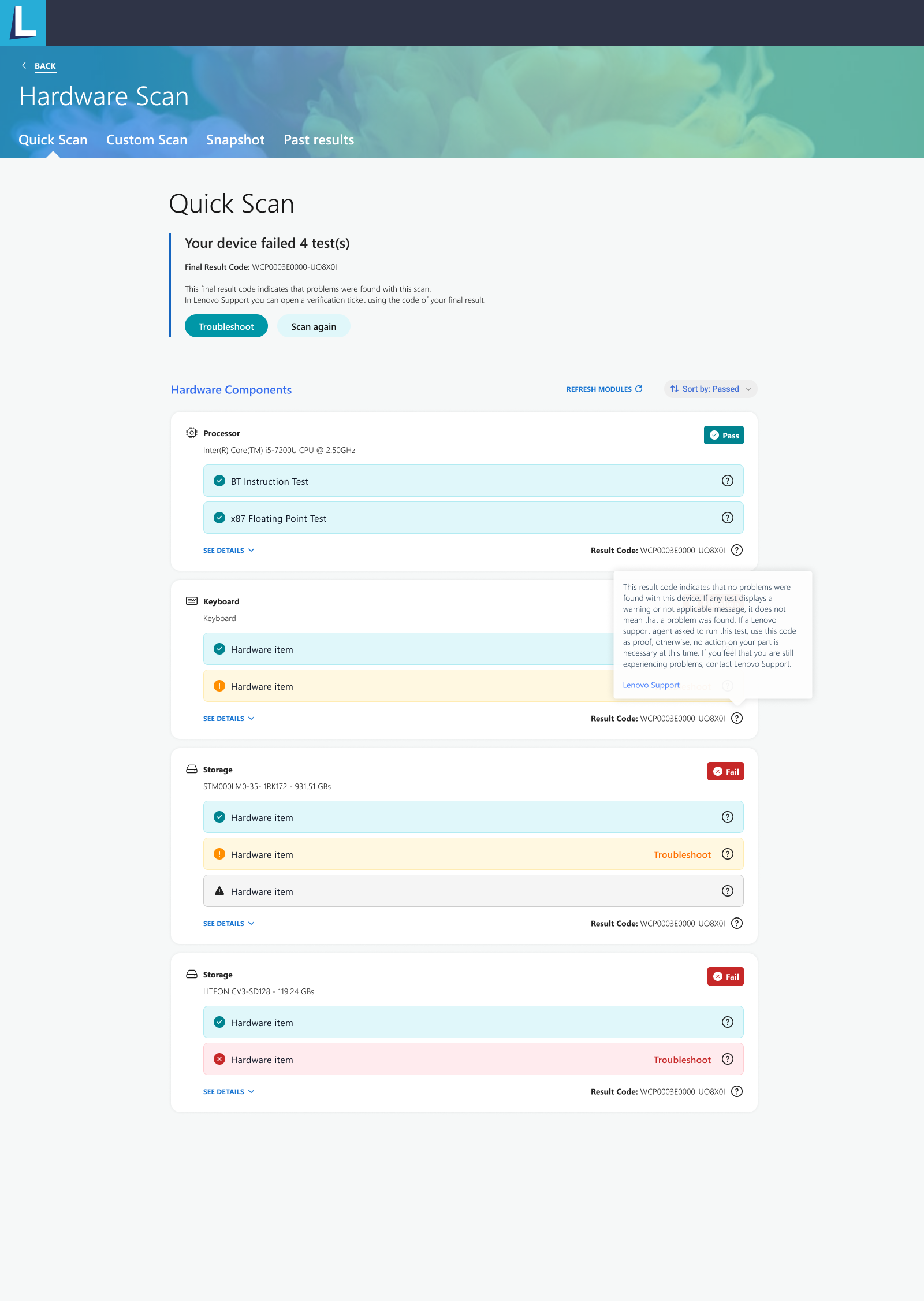
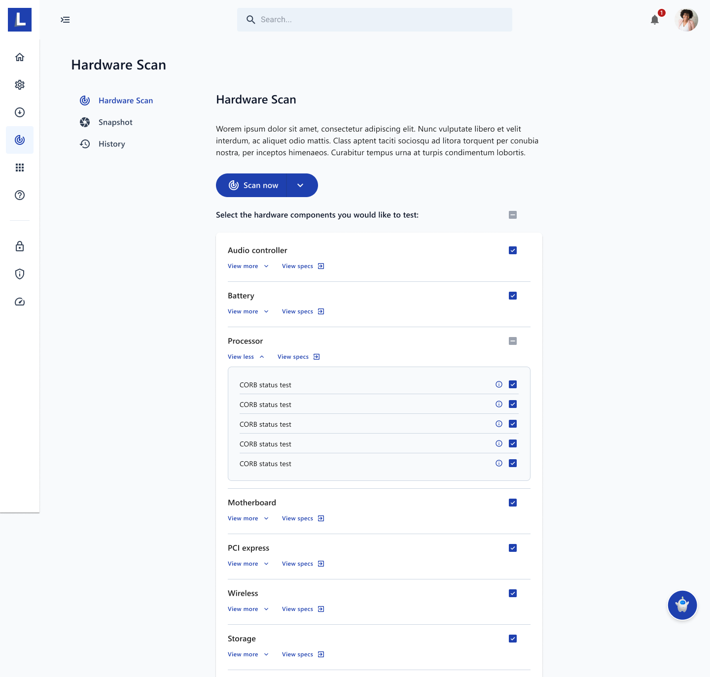
Use Case 2: Vantage Hardware Scan
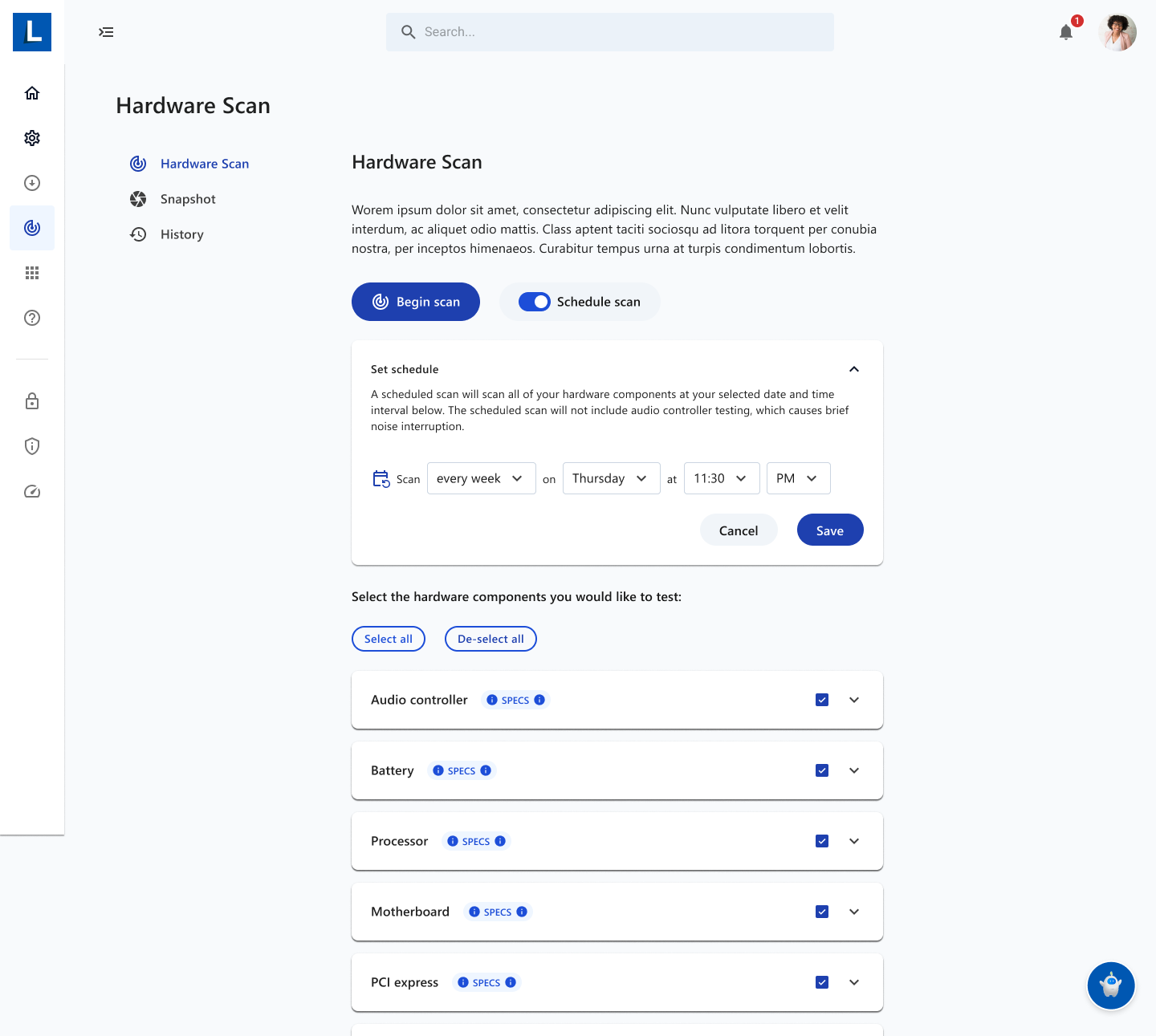
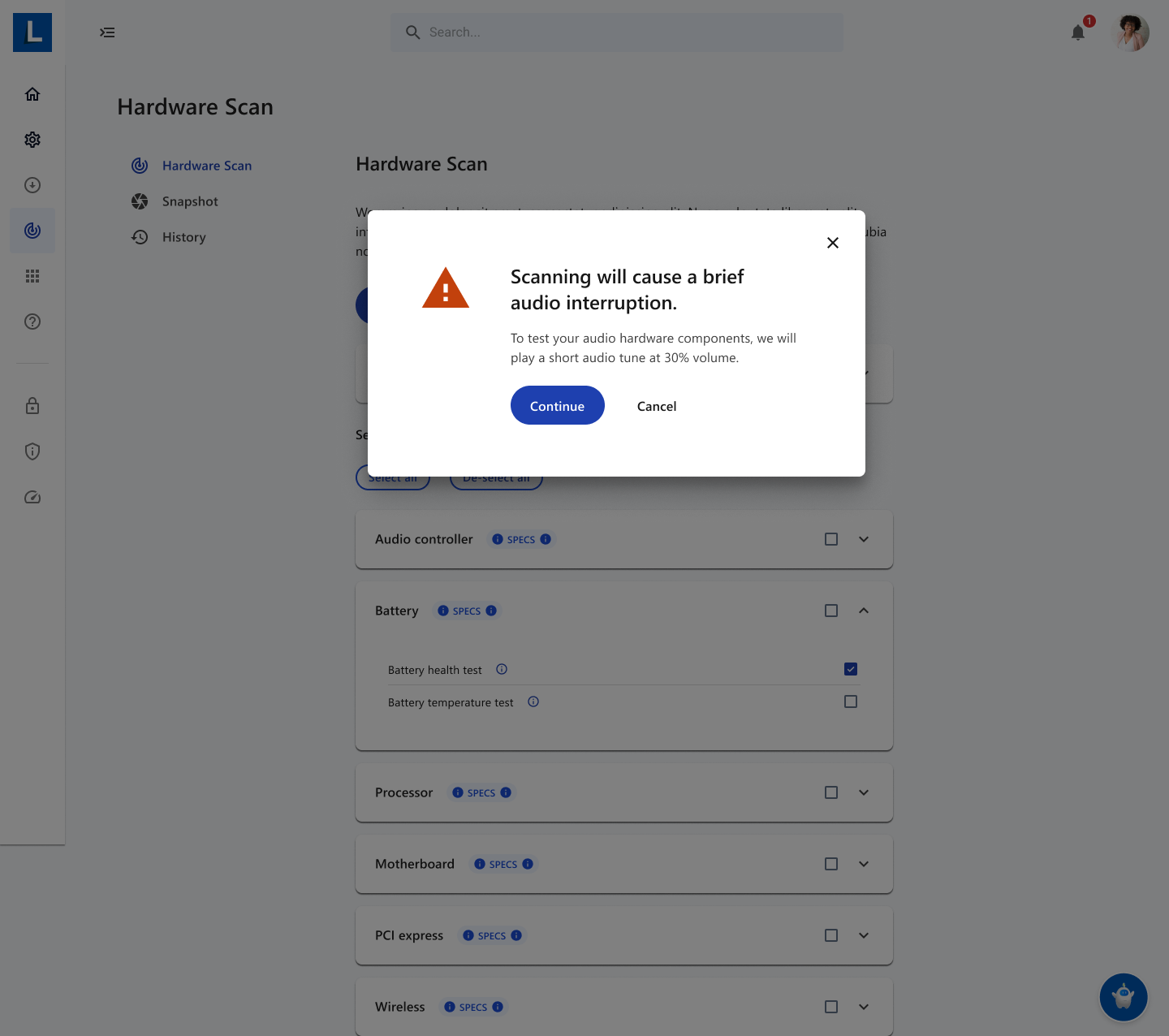
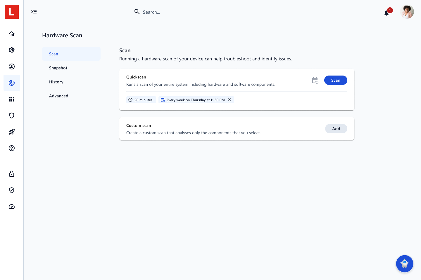
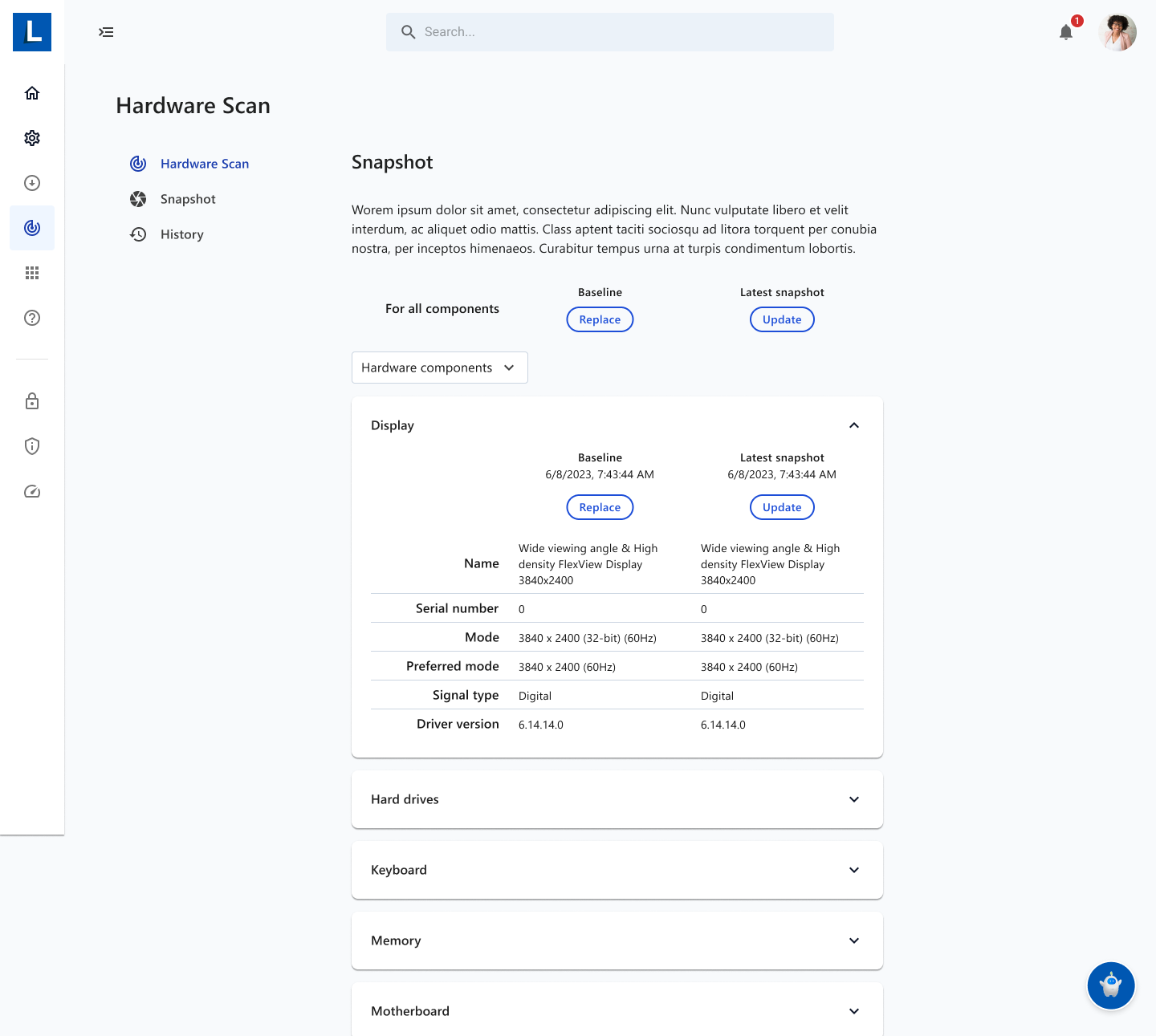
Another major Vantage functionality is Hardware Scan, which is tricky from a design perspective because of how much data has to be crammed into one view. We had to be creative with patterns like accordions & modals in order to extract content into readable & logical information hierarchies.
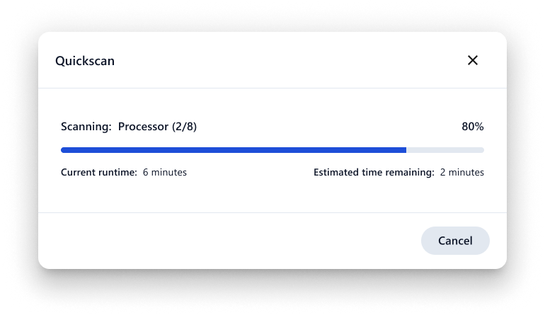
And here is what we landed on.
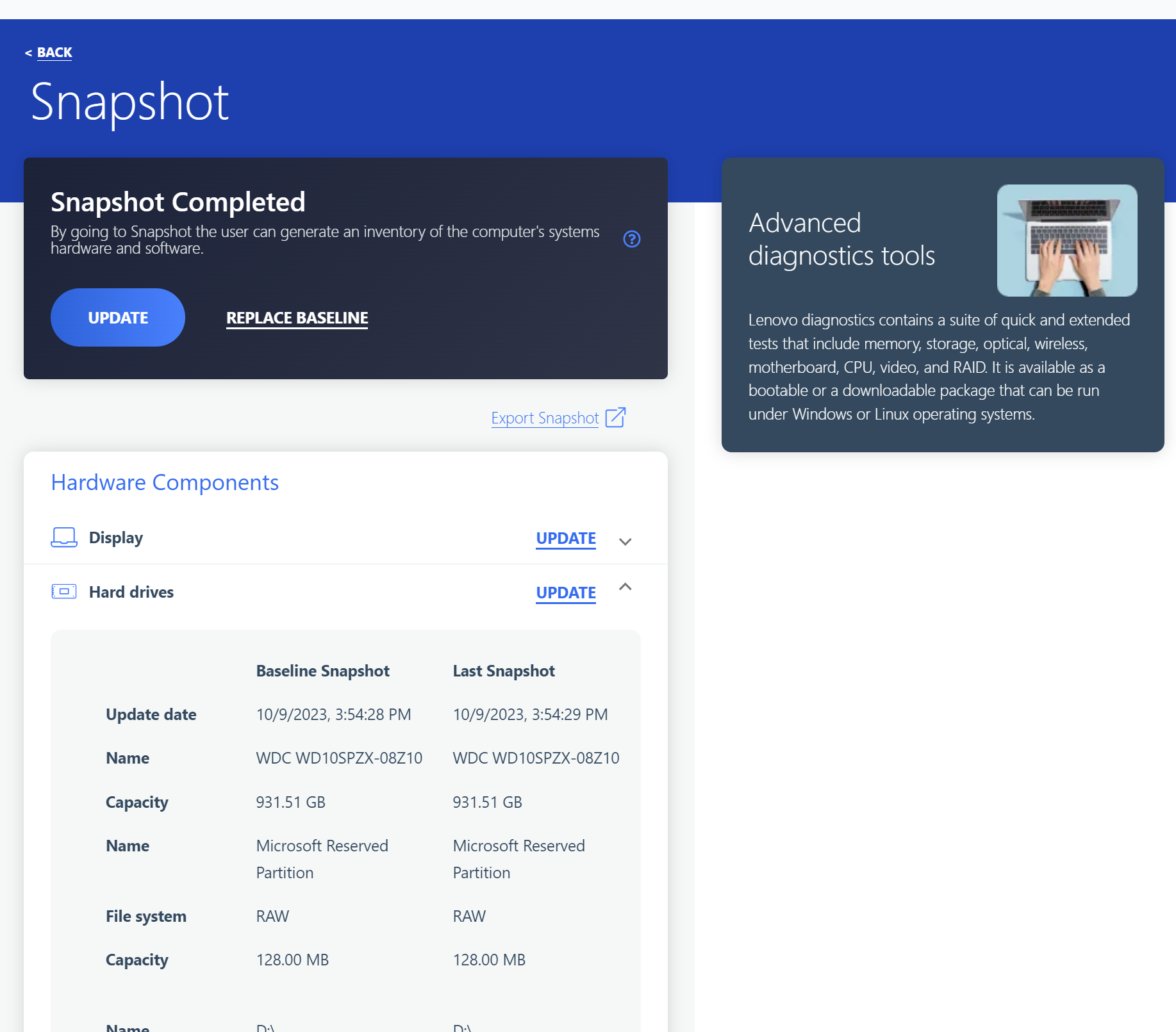
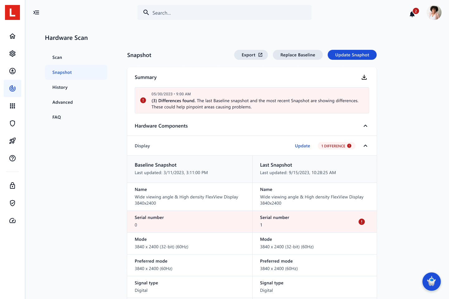
And within Hardware Scan were other tools such as Snapshot, which allows users to compare before and after scans of their hardware & software. This was particularly data heavy.
The final product:
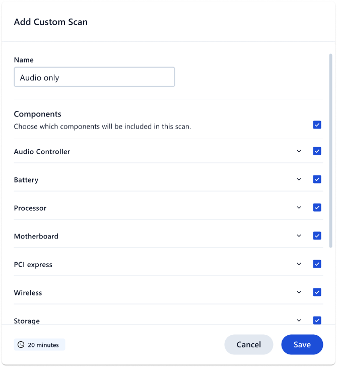
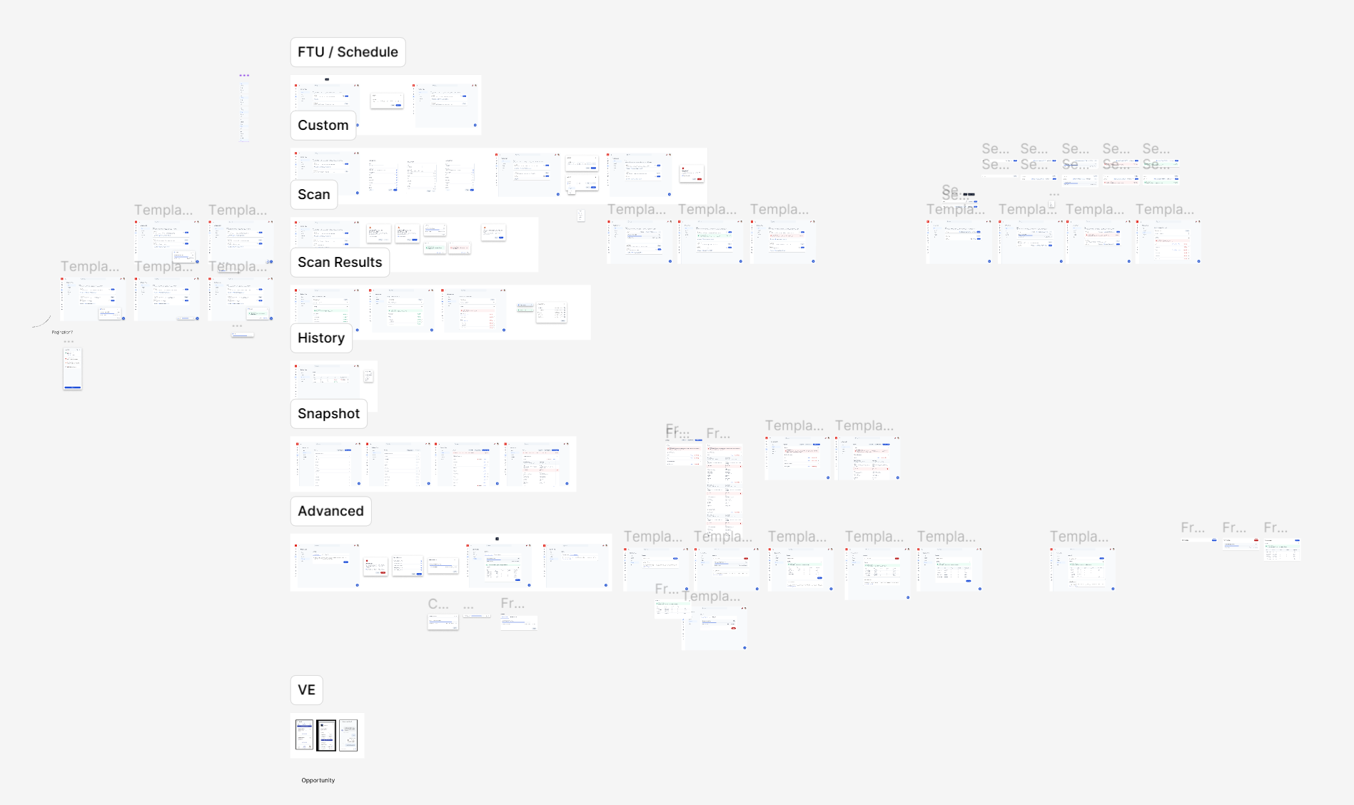
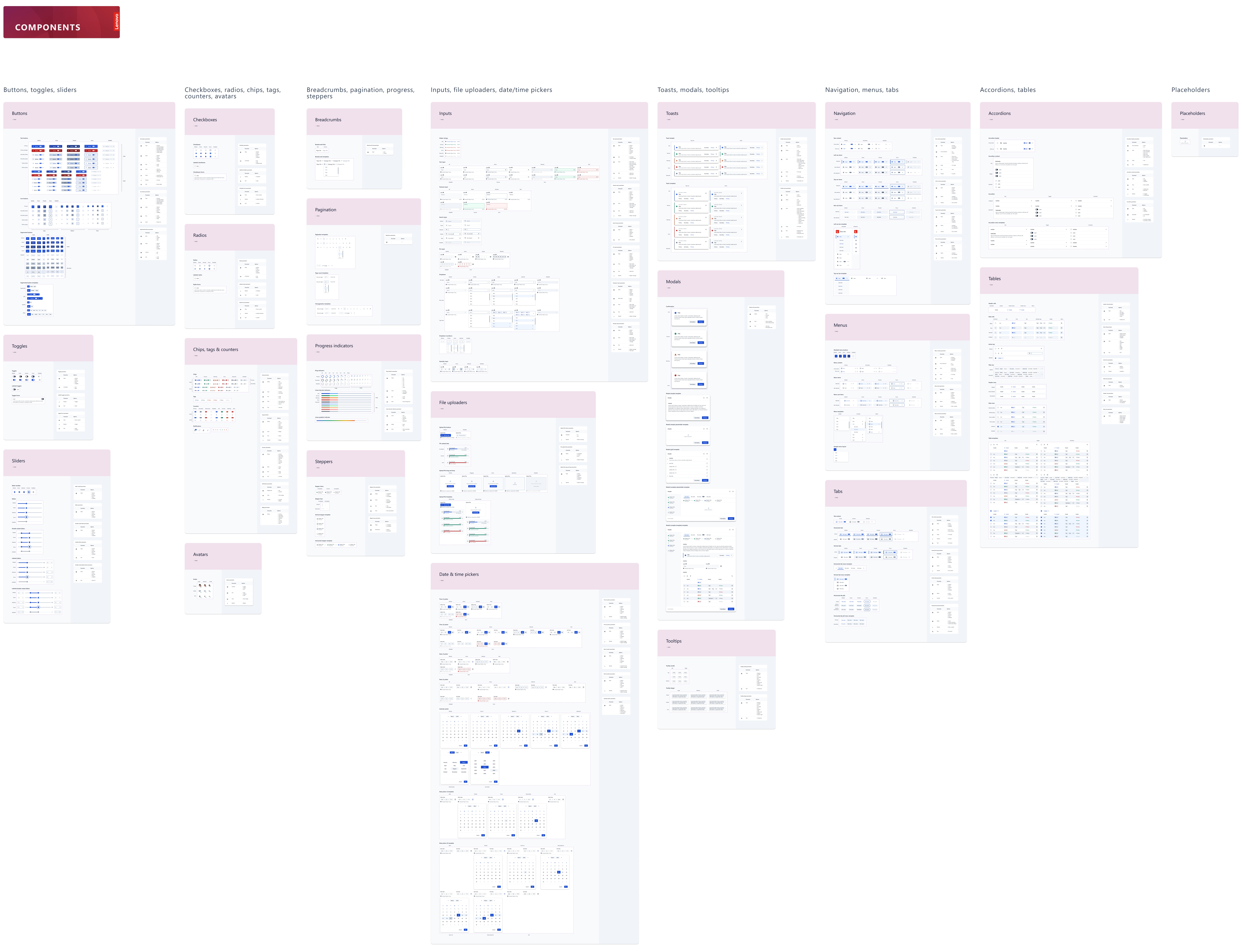
Hardware Scan had so many micro-functionalities and requirements that our Figma spread looked something like this on our last iteration:
2024 update: Now baking... Red Velvet!
As of October 2023, I have been working on developing my very own sub-system of Cake, called Red Velvet.
With all the knowledge I've gained from working on Cake with my design colleagues, I've been architecting Red Velvet from the ground up for a whole new user base.
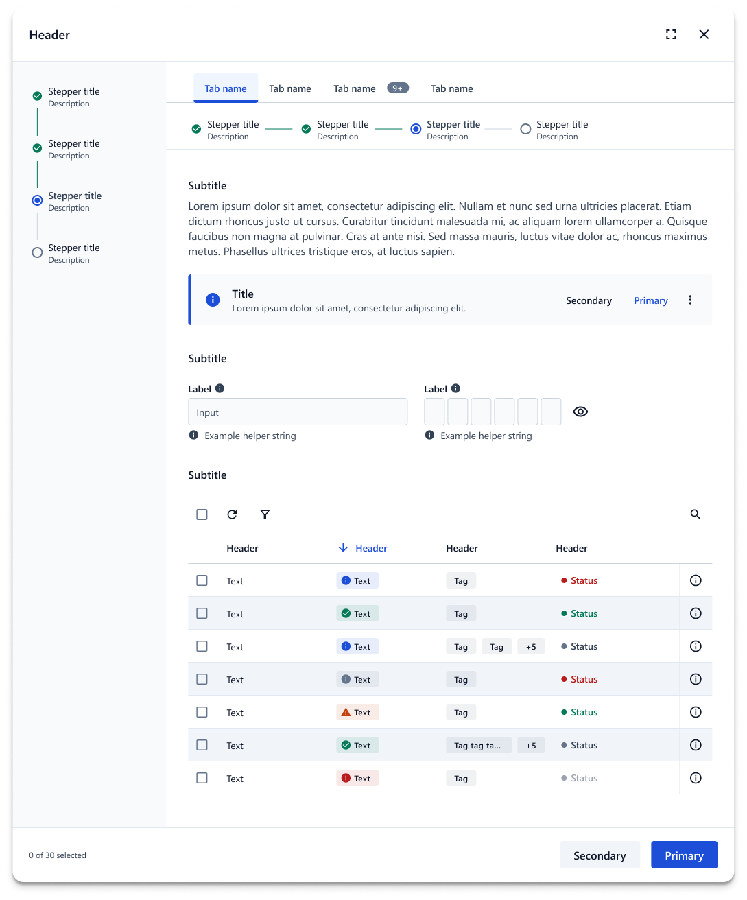
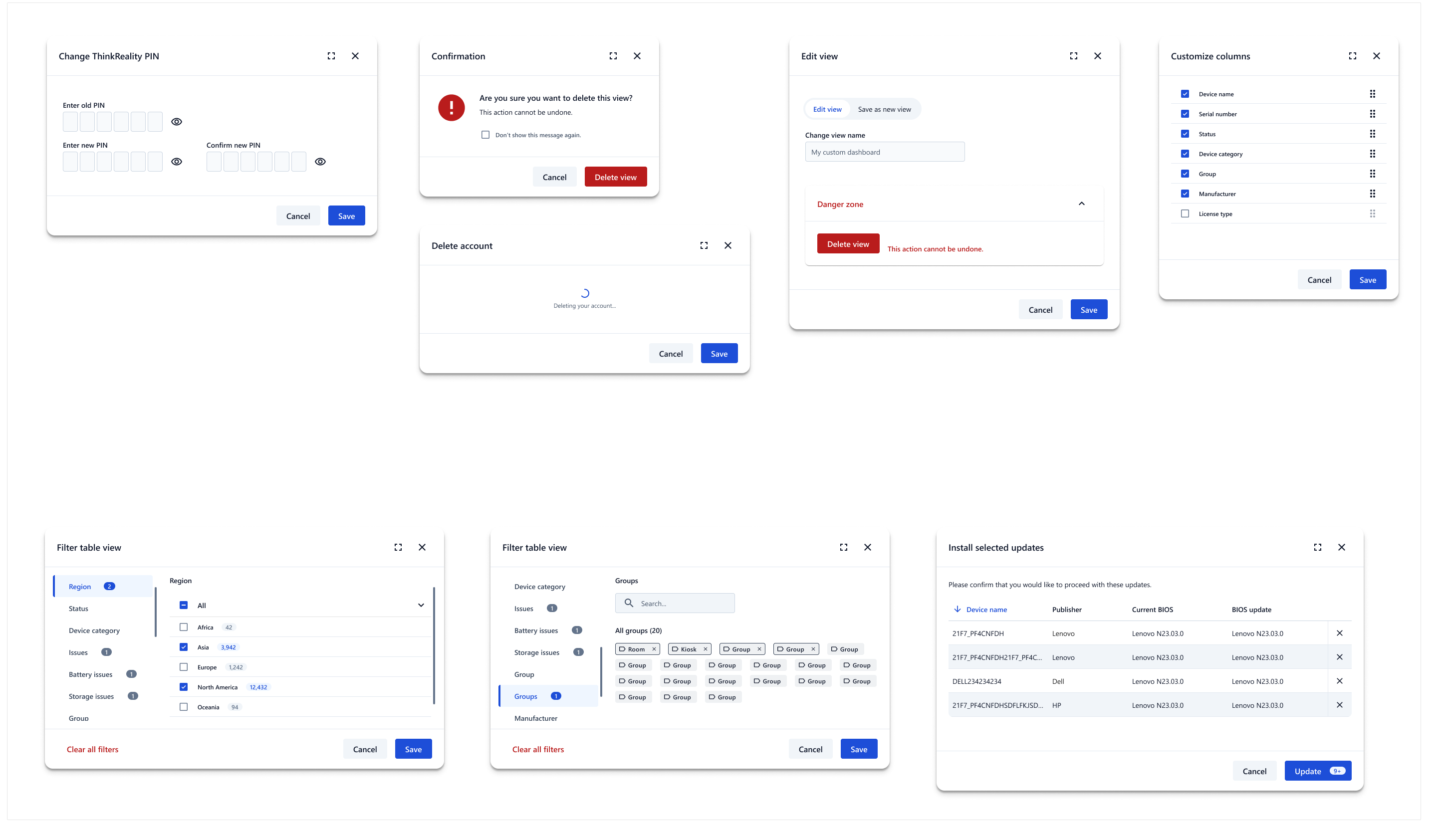
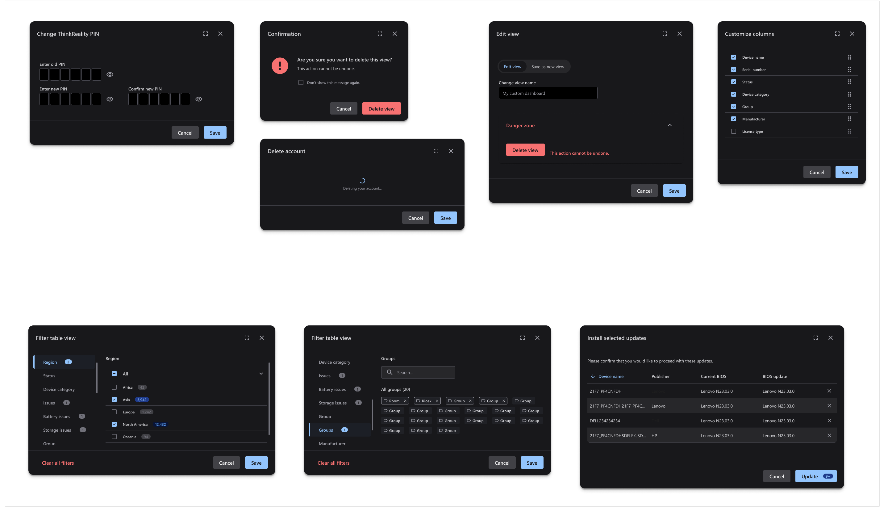
Red Velvet uses the foundational tokens of Cake (hence why it's a "sub-system") — but owns a totally fresh set of components & variants, since it is geared toward B2B cloud-based apps, such as Lenovo Device Manager. These apps, while being more commercial-facing, could still use a consumer-friendly design rehaul.
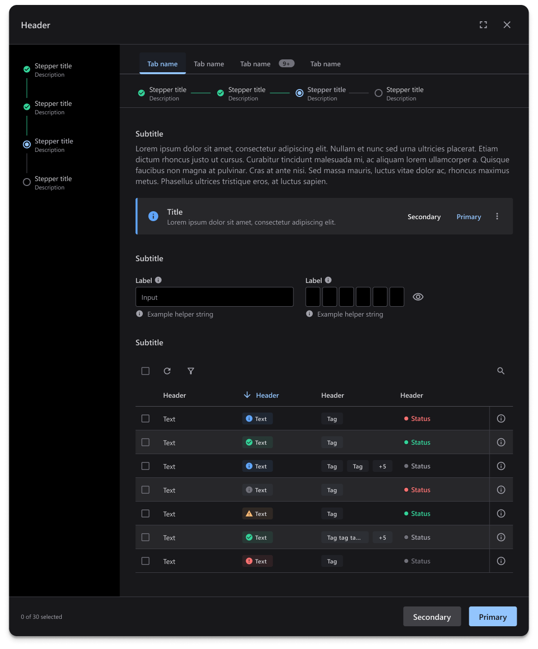
One of the great things about designing a sub-system that relies on the Cake tokens I architected previously is that dark mode is essentially built into the components. This is super handy, as Microsoft is pushing for dark mode as an accessibility requirement for applications in 2025.
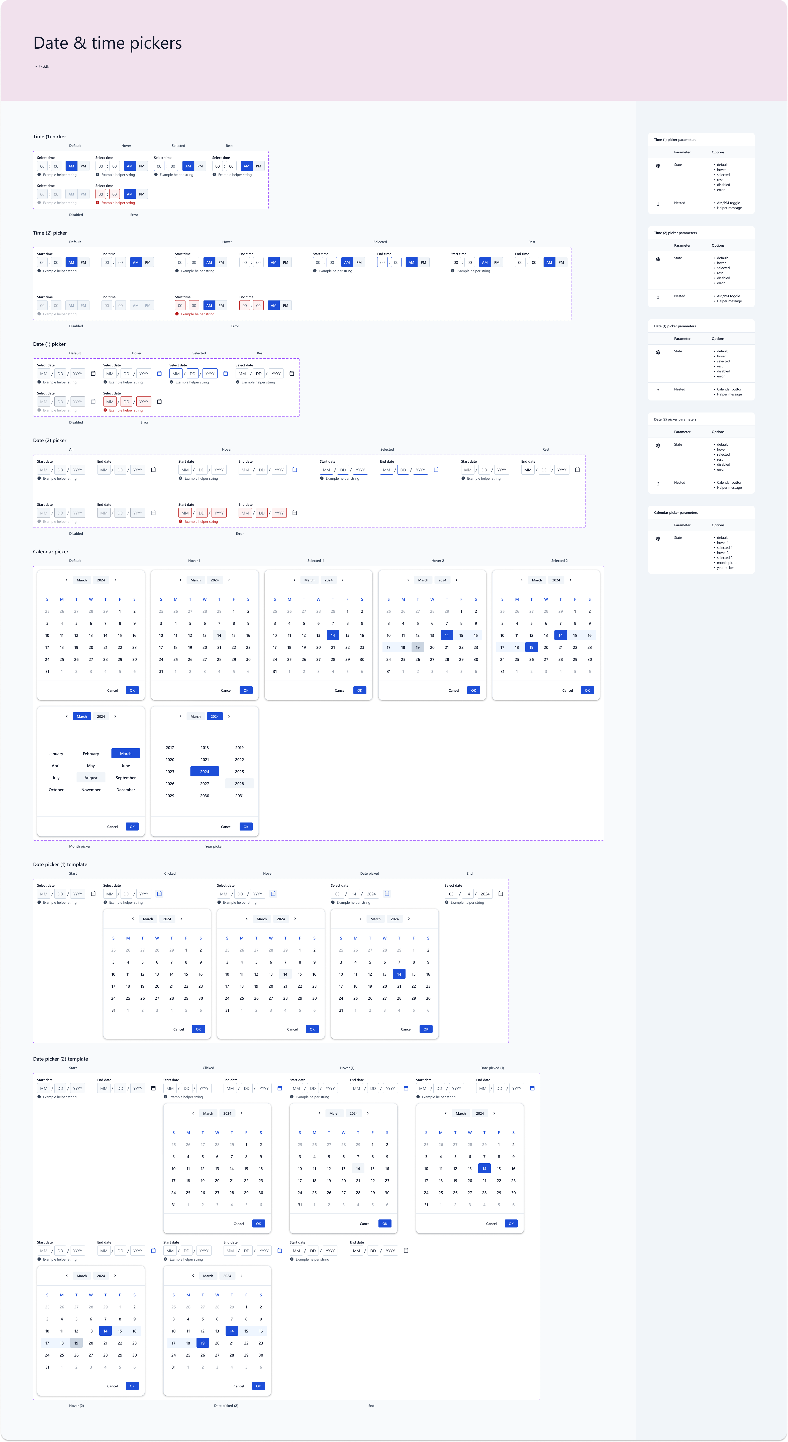
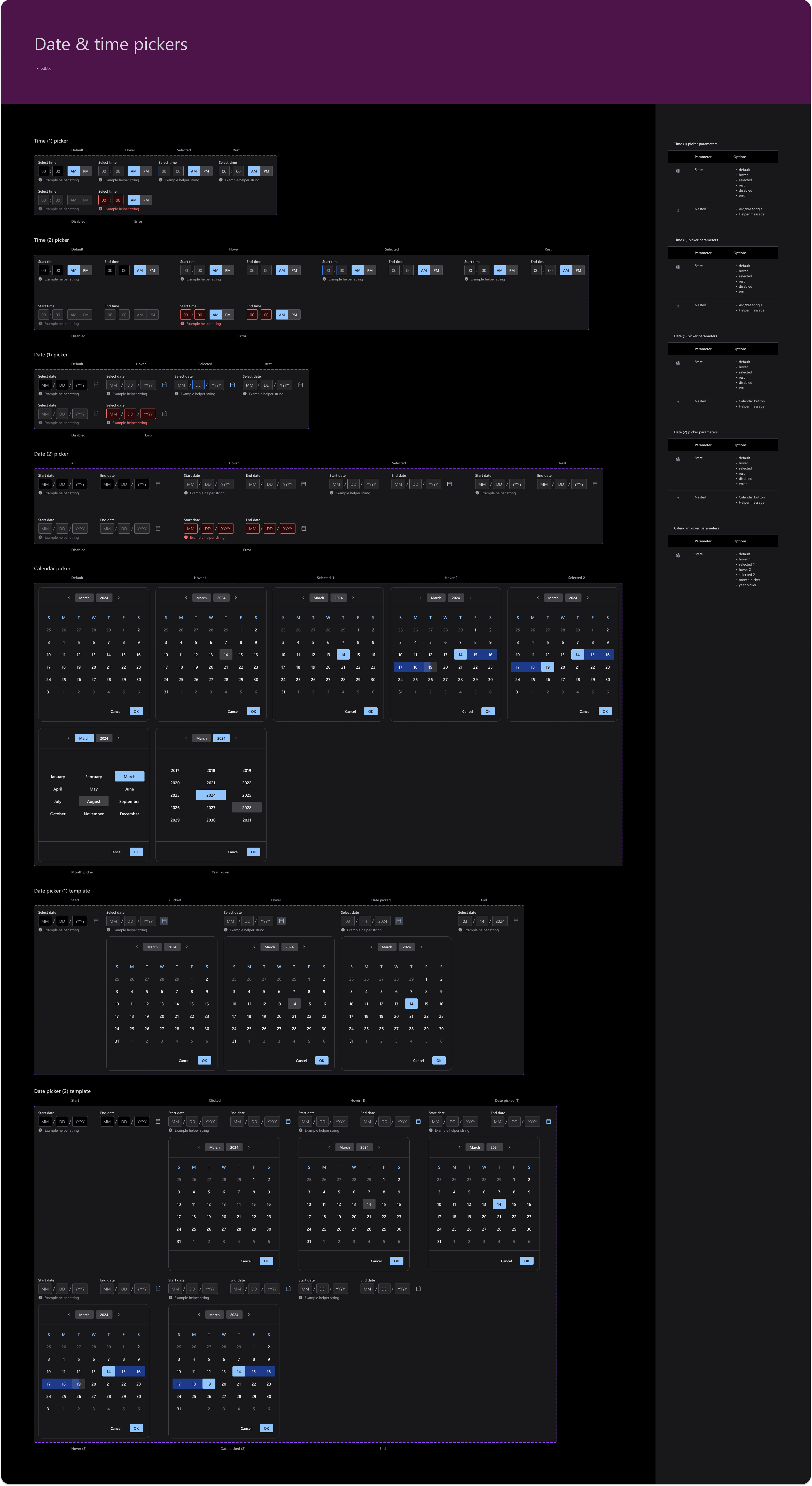
Red Velvet use case 1: Lenovo Device Manager
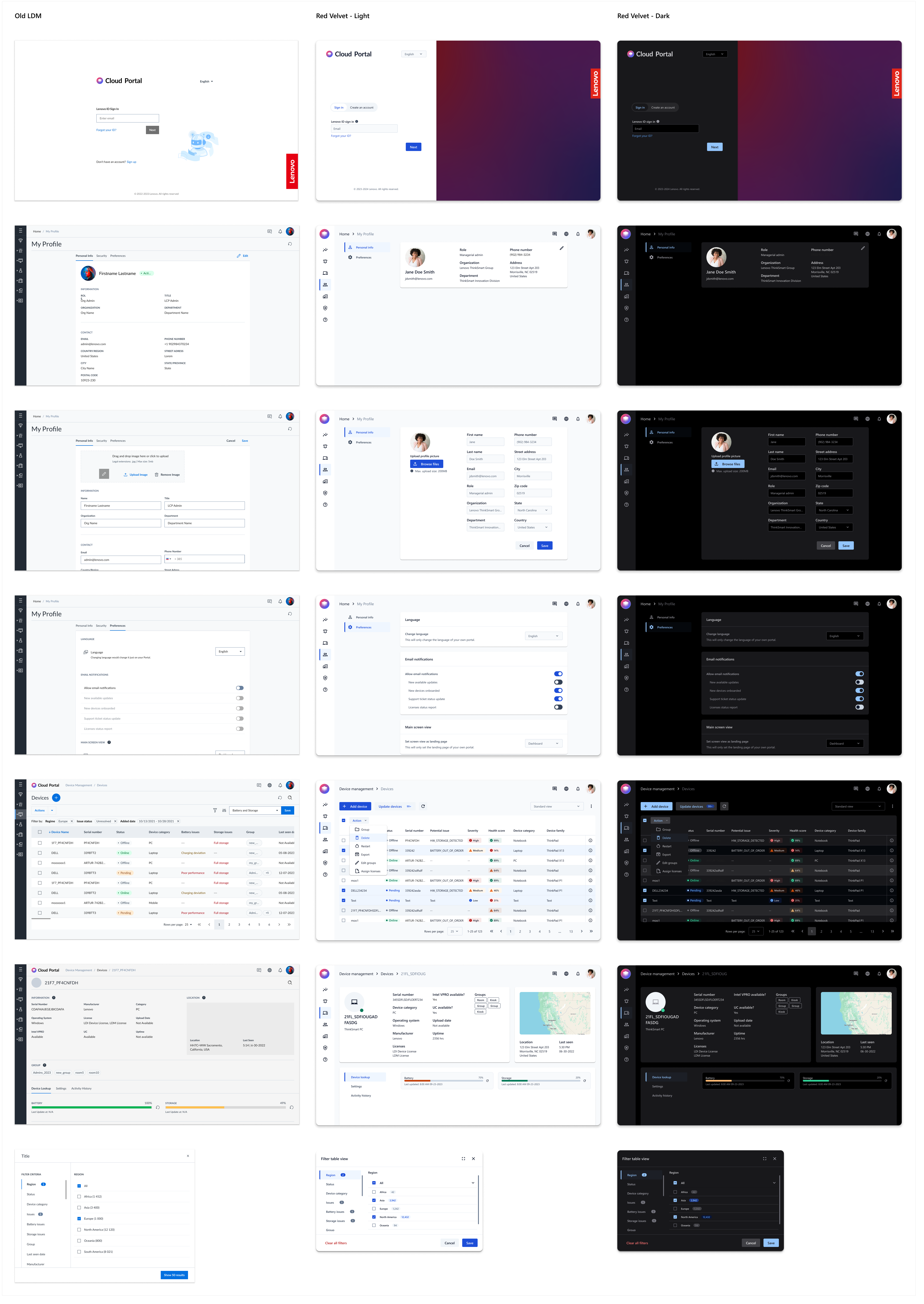
One of my first applications of Red Velvet was testing a redesign of Lenovo Device Manager, one of the most popular B2B cloud apps that Lenovo offers. LDM offers IT admin a "quick-glance" method of surveying fleet health, with options to telescope into details at any level.


You can really tell from this side-by-side comparison how badly the design refresh was needed. Plus, we were able to add a dark mode in a snap!
Red Velvet use case 2: Classroom Companion
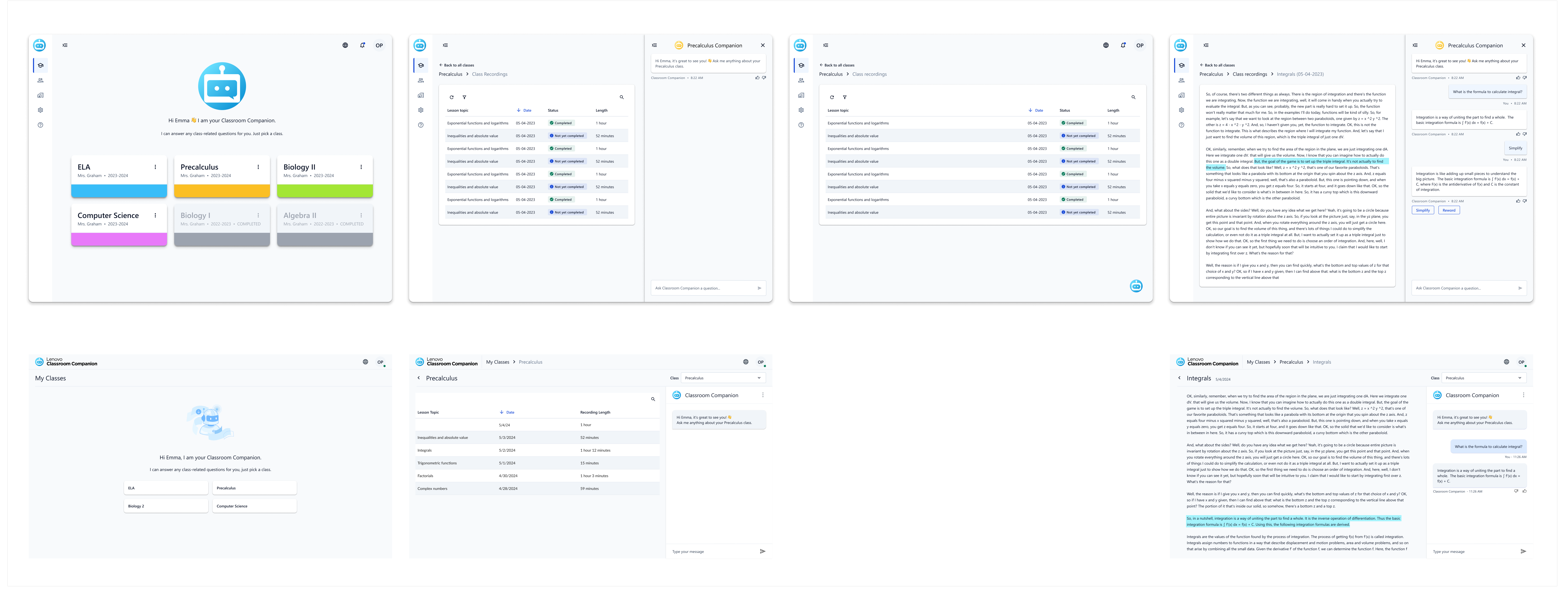
A few weeks after my work with LDM, the Classroom Companion team at Lenovo reached out to me asking for some help with a rebrand as well. Their case was pretty unique, as their app is not only consumer-facing but student-facing, which has its own set of design challenges. They named a few PO requirements to me, such as promoting a chatbot view, which was intended to aid students as they listened to online course recordings. This chatbot was silo'ed into each course; the "Precalculus Companion" could not answer questions about Biology, for instance, and they wanted to make this clear visually.
As Red Velvet did not have an existing chatbot component (Lenovo has many AI apps in the works right now, but none based on the Red Velvet design system until this product), my first task at hand was to consolidate some past Lenovo chatbot views to create a "One Lenovo" standardized component.

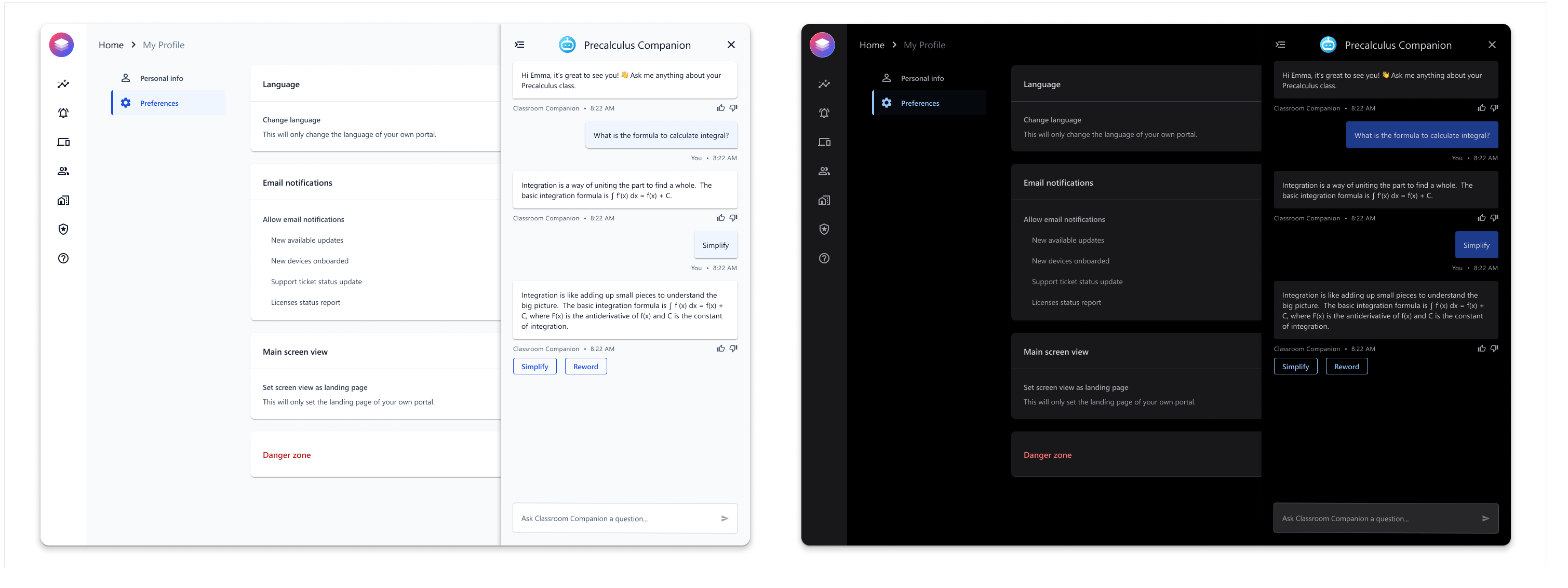
After creating the chatbot component, the rest of the redesign was fairly simple. Here is the final comparison, with mockups from the Classroom Companion team on the bottom row and my redesigns on the top row.
